In a previous post, I described some ways one might go about analyzing data from a stepped-wedge, cluster-randomized trial using a generalized additive model (a GAM), focusing on continuous outcomes. I have spent the past few weeks developing a similar model for a binary outcome, and have started to explore model comparison and methods to evaluate goodness-of-fit. The following describes some of my thought process.
Data generation
The data generation process I am using here follows along pretty closely with the earlier post, except, of course, the outcome has changed from continuous to binary. In this example, I’ve increased the correlation for between-period effects because it doesn’t seem like outcomes would change substantially from period to period, particularly if the time periods themselves are relatively short. The correlation still decays over time.
Here are the necessary libraries:
library(simstudy)
library(ggplot2)
library(data.table)
library(mgcv)
library(gratia)
library(patchwork)
library(mgcViz)
library(DHARMa)
library(itsadug)
The data generation, based on 24 sites, 25 time periods, and 100 individuals per site per time period, is formulated this way:
\[ y_{ijk} \sim Bin\left(p_{jk}\right) \\ \ \\ log\left( \frac{p_{ijk}}{1-p_{ijk}} \right) = -1.5 + a_j + b_{jk} + 0.65 A_{jk} \]
\(y_{ijk} \in \{0,1\}\) is the outcome, and \(p(y_{ijk} = 1) = p_{ijk}\). The log-odds ratio is a linear function of the site specific random intercept \(a_{j}\), the site-specific period \(k\) effect \(b_{jk}\), and treatment status of site \(j\) in period \(k\), \(A_{jk} \in \{ 0, 1\}\) depending the the stage of stepped wedge. The treatment effect in this case (an odds ratio) is \(exp(0.65) = 1.9\). The \(a_j \sim N(0, 0.6)\). The vector of site-period effects \(\mathbf{b_j} \sim N(0, \Sigma_b)\), where \(\Sigma_b = DRD\) is a \(25 \times 25\) covariance matrix based on a diagonal matrix \(D\) and an auto-regressive correlation structure \(R\):
\[ D = \sqrt{0.1} * I_{25 \times 25} \]
and
\[ R =\begin{bmatrix} 1 & \rho & \rho^2 & \dots & \rho^{24} \\ \rho & 1 & \rho & \dots & \rho^{23} \\ \rho^2 & \rho & 1 & \dots & \rho^{22} \\ \vdots & \vdots & \vdots & \vdots & \vdots \\ \rho^{24} & \rho^{23} & \rho^{22} & \dots & 1 \\ \end{bmatrix}, \ \ \rho = 0.95 \]
Here is the implementation of this data generation process using simstudy:
def <- defData(varname = "a", formula = 0, variance = 0.6)
def <- defData(def, varname = "mu_b", formula = 0, dist = "nonrandom")
def <- defData(def, varname = "s2_b", formula = 0.1, dist = "nonrandom")

defOut <- defDataAdd(varname = "y",
  formula = "-1.5 + a + b + 0.65 * A",
  dist = "binary", link="logit"
)

set.seed(1913)

ds <- genData(24, def, id = "site")
ds <- addPeriods(ds, 25, "site", perName = "k")
ds <- addCorGen(
  dtOld = ds, idvar = "site",
  rho = 0.95, corstr = "ar1",
  dist = "normal", param1 = "mu_b", param2 = "s2_b", cnames = "b"
)

ds <- trtStepWedge(ds, "site", nWaves = 24,
  lenWaves = 1, startPer = 1,
  grpName = "A", perName = "k"
)

ds$site <- as.factor(ds$site)

dd <- genCluster(ds, "timeID", numIndsVar = 100, level1ID = "id")
dd <- addColumns(defOut, dd)

dd
## site k a mu_b s2_b timeID b startTrt A id y
## 1: 1 0 0.142 0 0.1 1 -0.867 1 0 1 0
## 2: 1 0 0.142 0 0.1 1 -0.867 1 0 2 0
## 3: 1 0 0.142 0 0.1 1 -0.867 1 0 3 0
## 4: 1 0 0.142 0 0.1 1 -0.867 1 0 4 0
## 5: 1 0 0.142 0 0.1 1 -0.867 1 0 5 0
## ---
## 59996: 24 24 0.879 0 0.1 600 -0.291 24 1 59996 0
## 59997: 24 24 0.879 0 0.1 600 -0.291 24 1 59997 1
## 59998: 24 24 0.879 0 0.1 600 -0.291 24 1 59998 1
## 59999: 24 24 0.879 0 0.1 600 -0.291 24 1 59999 1
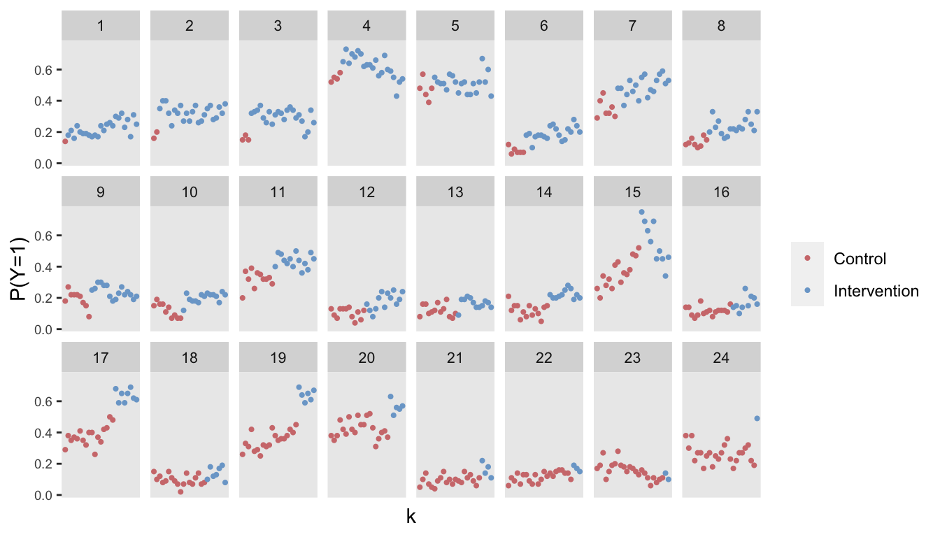
## 60000: 24 24 0.879 0 0.1 600 -0.291 24 1 60000 1Here is visualization of the observed proportions of a good outcome (\(y = 1\)) by site and period:
Model estimation using a GAM
The first model will include a treatment effect and an overall smooth function of time, and then a site-specific smooth “effect”. I am using the function bam in the mgcv package, though I could use the gamm function, the gam function, or even the gamm4 function of the gamm4 package. In this case, all provide quite similar estimates, but bam has the advantage of running faster with this large data set. Here is the model:
\[ \text{log-odds}\left[P(y_{ijk} = 1)\right] = \beta_0 + \beta_1 A_{jk} + s(k) + s_j(k) \]
fit.A <- bam(
  y ~ A + s(k) + s(k, site, bs = "fs"),
  data = dd,
  method = "fREML",
  family = "binomial"
)summary(fit.A)##
## Family: binomial
## Link function: logit
##
## Formula:
## y ~ A + s(k) + s(k, site, bs = "fs")
##
## Parametric coefficients:
## Estimate Std. Error z value Pr(>|z|)
## (Intercept) -1.4379 0.1548 -9.29 <2e-16 ***
## A 0.6828 0.0489 13.96 <2e-16 ***
## ---
## Signif. codes: 0 '***' 0.001 '**' 0.01 '*' 0.05 '.' 0.1 ' ' 1
##
## Approximate significance of smooth terms:
## edf Ref.df Chi.sq p-value
## s(k) 2.53 3.06 2.11 0.53
## s(k,site) 79.45 238.00 5865.39 <2e-16 ***
## ---
## Signif. codes: 0 '***' 0.001 '**' 0.01 '*' 0.05 '.' 0.1 ' ' 1
##
## R-sq.(adj) = 0.125 Deviance explained = 10.6%
## fREML = 85184 Scale est. = 1 n = 60000The model does well to recover the true values of the parameters used in the data generation process (not always guaranteed for a single data set). The plot on the right shows the “main” smooth effect of time (i.e., across all sites), and the plot on the left shows the site-specific effects over time. The between-site variability is quite apparent.
draw(fit.A) +
  plot_annotation("") &
  theme(panel.grid = element_blank())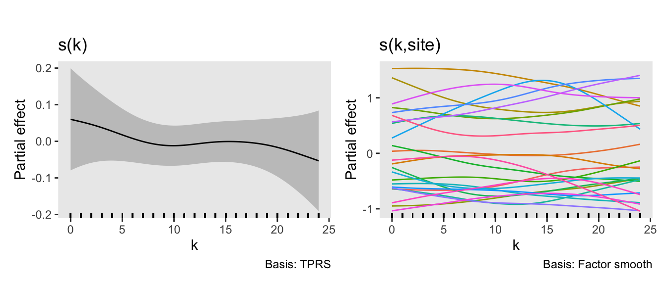
Goodness of fit
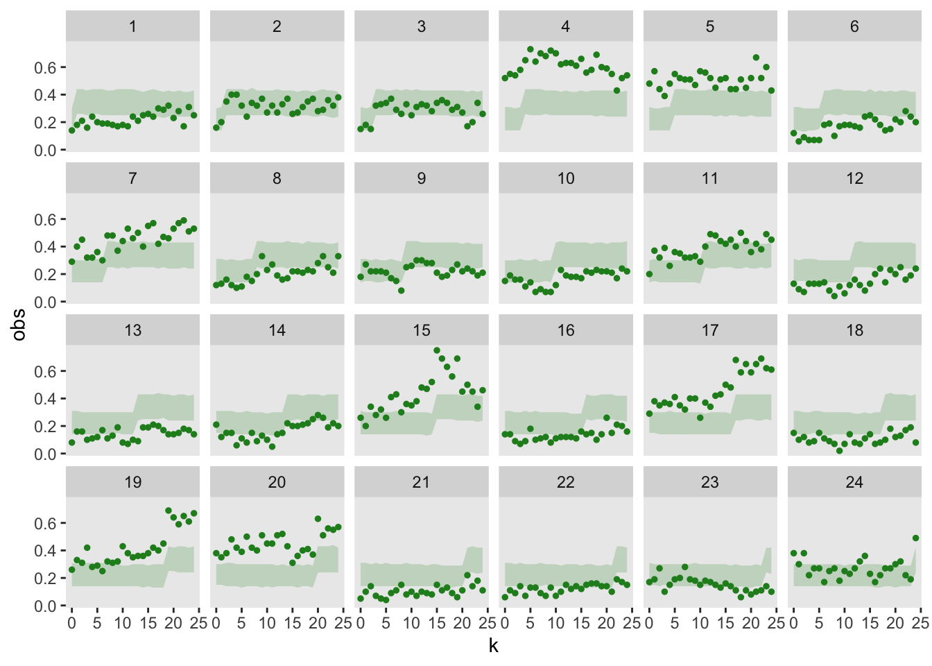
I am particularly interested in understanding if the model is a good fit based on the observed data. One way to do this is to repeatedly simulate predicted data from the model, and the visually assess whether the observed (i.e., actual) data falls reasonably into range of simulated data. To do this, I am using the simulate.gam function from the mgcViz package. I’ve created 95% bands based on the simulated data, and in this case it looks like the observed data fits into the bands quite well.
sim <- simulate.gam(fit.A, nsim = 1000)

ls <- split(sim, rep(1:ncol(sim), each = nrow(sim)))

dq <- lapply(ls,
  function(x) {
    d <- cbind(dd, sim = x)
    d[, .(obs = mean(y), sim = mean(sim)), keyby = .(site, k)]
  }
)

dl <- rbindlist(dq, idcol = ".id")
df <- dl[, .(obs = mean(obs), min = quantile(sim, p = 0.025),
             max = quantile(sim, 0.975)), keyby = .(site, k)]

ggplot(data = df, aes(x= k, y = obs)) +
  geom_ribbon(aes(x = k, ymin = min, ymax = max),
              alpha = 0.2, fill = "forestgreen") +
  geom_point(color = "forestgreen", size = 1) +

  facet_wrap( ~ site, ncol = 6) +
  theme(panel.grid = element_blank())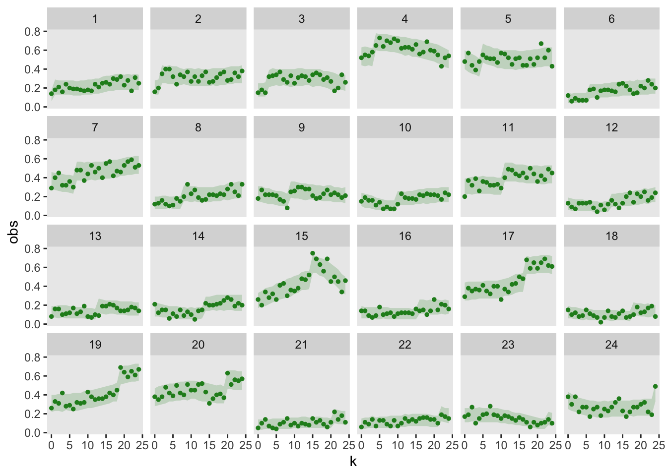
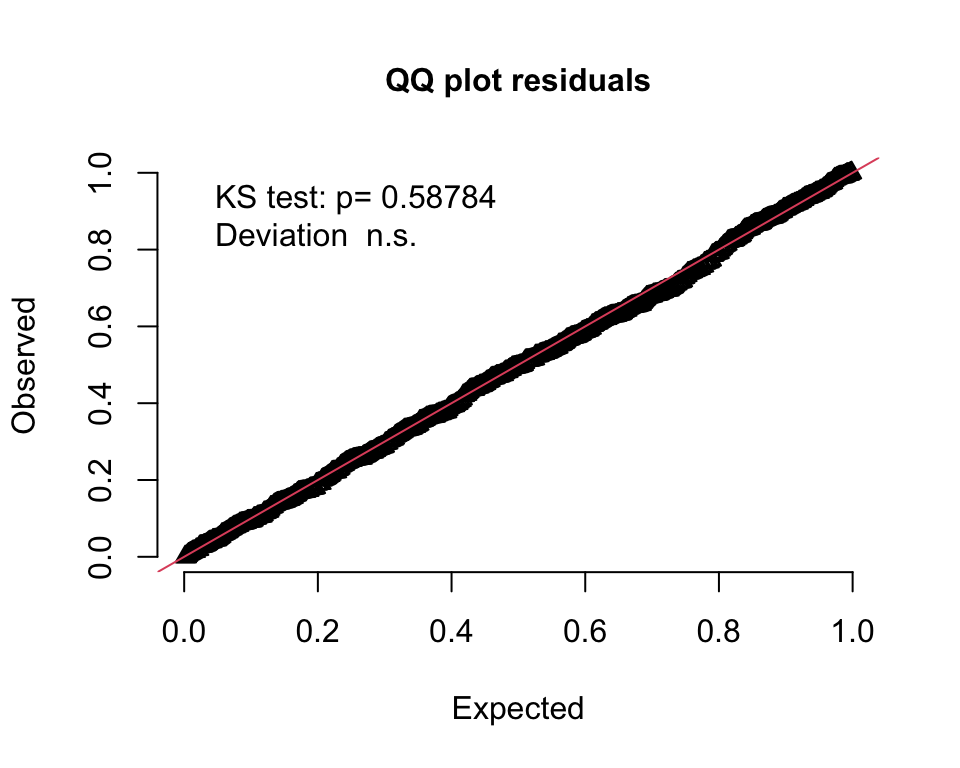
An alternative way to assess the goodness of fit is to generate a QQ-type plot that will alert us to any deviations. I am using the DHARMa package, which “uses a simulation-based approach to create readily interpretable quantile residuals for fitted generalized linear mixed models.” This residual is defined as “the value of the empirical density function at the value of the observed data.” The empirical density function comes from the same simulated data I just used to generate the 95% bands. It turns out that these residuals should be uniformly distributed if the model is a good fit. (See here for more details.)
The QQ-plot indicates a good fit if all the residuals lie on the diagonal line, as they do here:
simResp <- matrix(dl$sim, nrow = 600)
obsResp <- dq[[1]]$obs

DHARMaRes = createDHARMa(
  simulatedResponse = simResp,
  observedResponse = obsResp,
  integerResponse = F
)

plotQQunif(DHARMaRes, testDispersion = F, testOutliers = F)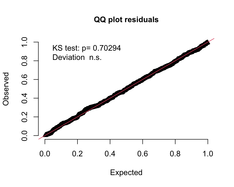
A plot of the residuals against the predicted values also indicates a uniform distribution:
plotResiduals(DHARMaRes, quantreg = T)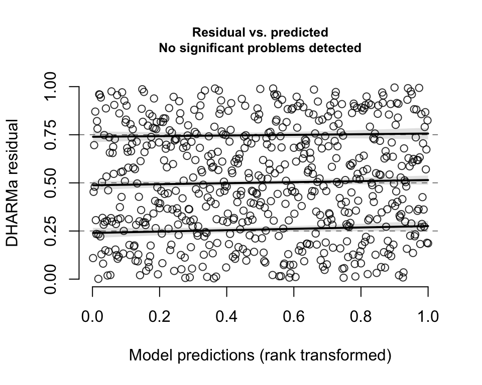
A model with no site-specific period effects
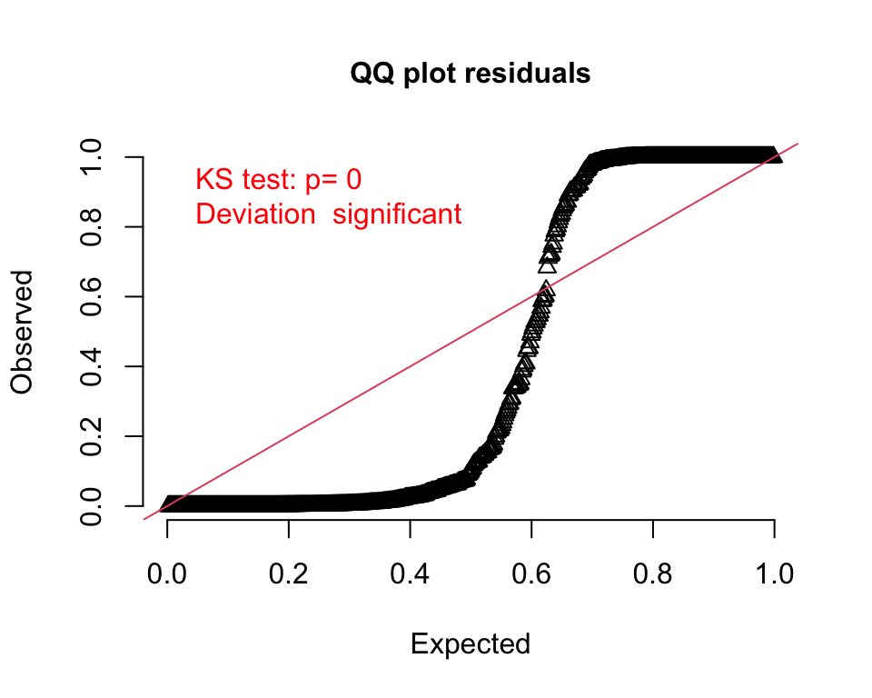
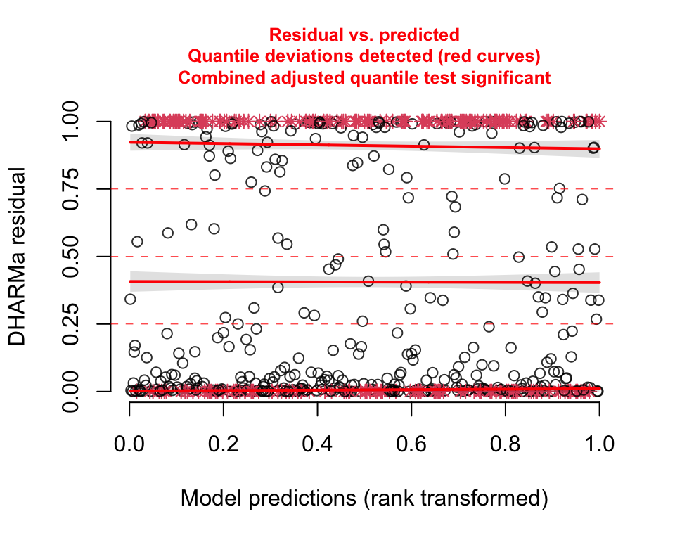
Now, it is clearly a bad idea to fit a model without site-specific time effects, since I generated the data under that very assumption. However, I wanted to make sure the goodness-of-fit tests signal that this reduced model is not appropriate:
fit.1curve <- bam(
  y ~ A + s(k, k = 4)  ,
  data = dd,
  method = "fREML",
  family = "binomial"
)
In the visual representation, it is apparent that the model is not properly capturing the site variability; for a number of sites, the observed data lies far outside the model’s 95% prediction bands:
Both the QQ- and residual plots are consistent with the prediction plot; it is pretty clear this second model is not a good fit:
We can formally compare the AIC from each model using function compareML from the package itsadug, which provides confirmation that the model with the site-specific curve is an improvement:
compareML(fit.A, fit.1curve)## fit.A: y ~ A + s(k) + s(k, site, bs = "fs")
##
## fit.1curve: y ~ A + s(k, k = 4)
##
## Model fit.1curve preferred: lower fREML score (37.173), and lower df (3.000).
## -----
## Model Score Edf Difference Df
## 1 fit.A 85184 7
## 2 fit.1curve 85147 4 -37.173 3.000
##
## AIC difference: -6308.48, model fit.A has lower AIC.A model with no treatment effect
It is not obvious that including a treatment effect is necessary, since the smoothed curve can likely accommodate the shifts arising due to treatment. After all, treatment is confounded with time. So, I am fitting a third model that excludes a term for the treatment effect:
fit.noA <- bam(
  y ~ s(k) + s(k, site, bs = "fs"),
  data = dd,
  method = "fREML",
  family = "binomial"
)
The QQ-plot indicates that this model fits quite well, which is not entirely a surprise. (The 95% band plot looks reasonable as well, but I haven’t it included here.)
However, if we compare the two models using AIC, then the model with the treatment effect does appear superior:
compareML(fit.A, fit.noA)## fit.A: y ~ A + s(k) + s(k, site, bs = "fs")
##
## fit.noA: y ~ s(k) + s(k, site, bs = "fs")
##
## Model fit.noA preferred: lower fREML score (28.266), and lower df (1.000).
## -----
## Model Score Edf Difference Df
## 1 fit.A 85184 7
## 2 fit.noA 85156 6 -28.266 1.000
##
## AIC difference: -113.13, model fit.A has lower AIC.My point here has been to show that we can indeed estimate flexible models with respect to time for data collected from a stepped wedge trial when the outcome is binary. And not only can we fit these models and get point estimates and measures of uncertainty, but we can also evaluate the goodness-of-fit to check the appropriateness of the model using a couple of different approaches.
In the earlier posts, I saw that the standard error estimate for the treatment effect is likely underestimated when the outcome is continuous. I did conduct a simulation experiment to determine if this is the case with a binary outcome, and unfortunately, it is. However, the extent of the bias seems to be small, particularly when the time trend is not too wiggly (i.e. is relatively stable within a reasonable time frame). I do feel comfortable using this approach, and will rely more on confidence intervals than p-values, particularly given the very large sample sizes. I will be particularly careful to draw conclusions about a treatment effect if the the point estimate of the effect size is quite low but still statistically significant based on the estimated standard errors.
Addendum (added 11/02/2023)
In the comments below, there was a question regarding the output from the function compareML, because in the first comparison above a p-value was reported, but in the second comparison, the p-value was not reported. I reached out to Jacolien van Rij, the developer of the itsadug package, and this is her response:
There is no p-value in the second comparison, because there is no trade-off between added complexity (in the sense of model terms) and increased explained variance. We use statistics to determine whether the explained variance is significantly increased while taking into account the increased complexity of the model. This is not the question in the second comparison, because model fit.noA is less complex AND explains more variance – so it’s an absolute win, we do not need to do model comparisons. (Unless the difference in explained variance is very small – but then we would generally prefer the simpler model too.)
Jacolien also had to additional bits of advice:
Important in model comparisons is that you compare models that are minimally different. In the first comparison, this is not the case: model fit.A is different in two aspects, namely it is missing the random effects term and it’s smooth term is constrained to a k of 4. So this is not a comparison I would recommend doing.
Note that you’re doing a Chisquare test on fREML scores, rather than ML scores. REML scores are not valid for model comparison procedures, as the fitted fixed effects of the two models may not be constrained/fitted in the same way. Instead, please use ML scores (add method=“ML” in bam(), which may take more time to run ) for model comparison. I’m planning to add a warning in the next version of the package.