Recently I wrote about the challenges of trying to learn too much from a small pilot study, even if it is a randomized controlled trial. There are limitations on how much you can learn about a treatment effect given the small sample size and relatively high variability of the estimate. However, the temptation for researchers is usually just too great; it is only natural to want to see if there is any kind of signal of an intervention effect, even though the pilot study is focused on questions of feasibility and acceptability.
Through my work with the NIA IMPACT Collaboratory, I have been involved with planning a research initiative to test the feasibility of studying a highly innovative strategy in nursing homes to reduce the risk of Covid-19 infections among both residents and staffs. Given that the strategy is so novel, there are big questions about whether it can even be implemented, and how the outcome measures can be collected. So, it may be premature to figure out if the approach will reduce infection. But still, it is hard not to try to gain a little insight into the potential effect of the intervention.
One of the lead investigators suggested a permutation test, because we know the sample is going to be small and we might not want to be forced to make parametric assumptions about the outcome. In the context of a pilot study, the permutation test might give a crude indication about the potential impact of an intervention. Would the full-blown follow-up study be conducted if there is no observed effect in the pilot? That is a bigger question. But, the suggestion of some sort of signal might provide additional motivation if feasibility was no longer a question; we would still need to be careful about how we incorporate these findings into planning for the bigger study.
Permutation test explained, briefly
Typically, if we are comparing outcomes for two treatment arms, we calculate a statistic that quantifies the comparison. For example, this could be a difference in group means, a risk ratio, or a log-odds ratio. For whatever statistic we use, there would be an underlying sampling distribution of that statistic under the assumption that there is no difference between the two groups. Typically, the sampling distribution would be estimated analytically using additional assumptions about the underlying distributions of the observed data, such as normal or Poisson. We then use the sampling distribution to calculate a p-value for the observed value of the statistic.
The permutation approach is an alternative way to generate the sampling distribution of the statistic under an assumption of no group differences without making any assumptions about the distributions of the data. If group membership does not influence the outcome, it wouldn’t matter if we re-arranged all the treatment assignments in the data. We could do that and estimate the statistic. In fact, we could do that for all the possible arrangements, and that would give us a distribution of the statistic for that sample under the assumption of no group effect. (If the number of possible arrangements is excessive, we could just take a large sample of those possible arrangements, which is what I do below.) To get a p-value, we compare the observed statistic to this manufactured distribution.
Now to the simulations.
The data generation process
In this proposed study, we are interested in measuring the rate of Covid-19 infection in 8 nursing homes. Given the nature of the spread of disease and the inter-relationship of the infections between residents, the nursing home is the logical unit of analysis. So, we will only have 8 observations - hardly anything to hang your hat on. But, can the permutation provide any useful information?
The data generation process starts with generating a pool of residents at each site, about 15 per home. The study will run for followed for 4 months (or 120 days), and residents will come and go during that period. We are going to assume that the average residence time is 50 days at each home, but there will be some variability. Based on the number of patients and average length of stay, we can calculate the number of patient-days per site. The number of infected patients \(y\) at a site is a function of the intervention and the time of exposure (patient-days). We will be comparing the average rates (\(y/patDays\)) for the two groups.
In the first simulation, I am assuming no treatment effect, because I want to assess the Type 1 error (the probability of concluding there is an effect given we know there is no effect).
Here is a function to generate the data definitions and a second function to go through the simple data generation process:
library(simstudy)
library(parallel)
defs <- function() {
def <- defDataAdd(varname = "nRes", formula = 15, dist = "poisson")
def <- defDataAdd(def, varname = "nDays", formula = 50, dist = "poisson")
def <- defDataAdd(def, varname = "patDays",
formula = "nRes * pmin(120, nDays)",
dist = "nonrandom")
def <- defDataAdd(def, varname = "y",
formula = "-4 - 0.0 * rx + log(patDays)",
variance = 1,
dist = "negBinomial", link = "log")
def <- defDataAdd(def, varname = "rate",
formula = "y/patDays",
dist = "nonrandom")
return(def[])
}gData <- function(n, def) {
dx <- genData(n)
dx <- trtAssign(dx, grpName = "rx")
dx <- addColumns(def, dx)
dx[]
}And here we actually generate a single data set:
RNGkind(kind = "L'Ecuyer-CMRG")
#set.seed(72456)
set.seed(82456)

def <- defs()
dx <- gData(8, def)
dx
## id rx nRes nDays patDays y rate
## 1: 1 1 16 40 640 0 0.000000000
## 2: 2 0 9 59 531 8 0.015065913
## 3: 3 1 20 57 1140 58 0.050877193
## 4: 4 1 14 51 714 14 0.019607843
## 5: 5 1 7 59 413 4 0.009685230
## 6: 6 0 14 38 532 4 0.007518797
## 7: 7 0 10 40 400 19 0.047500000
## 8: 8 0 11 56 616 22 0.035714286The observed difference in rates is quite close to 0:
dx[, mean(rate), keyby = rx]## rx V1
## 1: 0 0.02644975
## 2: 1 0.02004257obs.diff <- dx[, mean(rate), keyby = rx][, diff(V1)]
obs.diff## [1] -0.006407182The permutation test
With 8 sites, there are \(8!\) possible permutations, or a lot ways to scramble the treatment assignments.
factorial(8)## [1] 40320I decided to implement this myself in a pretty rudimentary way, though there are R packages out there that can certainly do this better. Since I am comparing averages, I am creating a vector that represents the contrast.
rx <- dx$rx/sum(dx$rx)
rx[rx==0] <- -1/(length(dx$rx) - sum(dx$rx))

rx
## [1] 0.25 -0.25 0.25 0.25 0.25 -0.25 -0.25 -0.25I’m taking a random sample of 5000 permutations of the contrast vector, storing the results in a matrix:
perm <- t(sapply(1:5000, function(x) sample(rx, 8, replace = FALSE)))
head(perm)
## [,1] [,2] [,3] [,4] [,5] [,6] [,7] [,8]
## [1,] -0.25 -0.25 0.25 -0.25 0.25 0.25 -0.25 0.25
## [2,] -0.25 -0.25 0.25 -0.25 0.25 -0.25 0.25 0.25
## [3,] 0.25 -0.25 -0.25 0.25 -0.25 -0.25 0.25 0.25
## [4,] 0.25 -0.25 0.25 0.25 -0.25 0.25 -0.25 -0.25
## [5,] -0.25 -0.25 -0.25 0.25 0.25 0.25 0.25 -0.25
## [6,] 0.25 -0.25 0.25 -0.25 0.25 -0.25 0.25 -0.25Using a simple operation of matrix multiplication, I’m calculating a rate difference for each of the sampled permutations:
perm.diffs <- perm %*% dx$rate
head(perm.diffs)
## [,1]
## [1,] 0.005405437
## [2,] 0.025396039
## [3,] 0.004918749
## [4,] -0.007490399
## [5,] -0.004336380
## [6,] 0.007538896Here is an estimate of the 2-sided p-value:
mean(abs(perm.diffs) > abs(obs.diff))## [1] 0.7166And finally, here is a histogram of the permuted rate differences, with the observed rate different overlaid as a red line. The observed value lies pretty much right in the middle of the distribution, which is what the p-value suggests:
ggplot(data = data.frame(perm.diffs), aes(x = perm.diffs)) +
  geom_histogram(binwidth = .005, color = "white") +
  geom_vline(xintercept = obs.diff, color = "red") +
  scale_y_continuous(expand = c(0,0), breaks = seq(2500, 10000, 2500)) +
  theme(panel.grid = element_blank())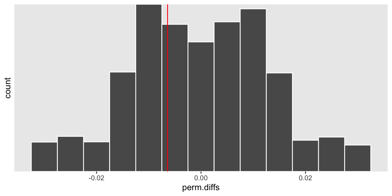
Operating characteristics
As in a power analysis by simulation, we can estimate the Type 1 error rate by generating many data sets, and for each one calculate a p-value using the permutation test. The proportion of p-values less than 0.05 would represent the Type 1 error rate, which should be close to 0.05.
iter <- function(n) {

  dx<- gData(n, defs())
  obs.diff <- dx[, mean(rate), keyby = rx][, diff(V1)]

  rx <- dx$rx/sum(dx$rx)
  rx[rx==0] <- -1/(n - sum(dx$rx))

  perm <- t(sapply(1:20000, function(x) sample(rx, n, replace = FALSE)))

  perm.diffs <- perm %*% dx$rate
  mean(abs(perm.diffs) > abs(obs.diff))
}
Here we use 5000 data sets to estimate the Type 1 error rate under the data generating process we’ve been using all along, and for each of those data sets we use 5000 permutations to estimate the p-value.
res <- unlist(mclapply(1:5000, function(x) iter(8), mc.cores = 4))
mean(res < .05)
## [1] 0.0542The risks of using a model (with assumptions)
If we go ahead and try to find a signal using a parametric model, there’s a chance we’ll be led astray. These data are count data, so it would not be strange to consider Poisson regression model to estimate the treatment effect (in this case, the effect would be a rate ratio rather than a rate difference). Given that the data are quite limited, we may not really be in a position to verify whether the Poisson distribution is appropriate; as a result, it might be hard to actually select the right model. (In reality, I know that this model will lead us astray, because we used a negative binomial distribution, a distribution with more variance than the Poisson, to generate the count data.)
Just as before, we generate 5000 data sets. For each one we fit a generalized linear model with a Poisson distribution and a log link, and store the effect estimate along with the p-value.
chkglm <- function(n) {

  dx <- gData(n, defs())
  glmfit <- glm( y ~ rx + offset(log(patDays)), family = poisson, data = dx)

  data.table(t(coef(summary(glmfit))["rx",]))

}

glm.res <- rbindlist(mclapply(1:5000, function(x) chkglm(8)))
The estimated Type 1 error is far greater than 0.05; there would be a pretty good chance that we will be over-enthusiastic about the potential success of our new nursing home strategy if it was not actually effective.
glm.res[, .(mean(`Pr(>|z|)` < 0.05))]## V1
## 1: 0.6152When there is a treatment effect
In the case where there is actually a treatment effect, the observed effect size is more likely to fall closer to one of the distribution’s tails, depending on the direction of the effect. If the treatment reduces the number infections, we would expect the rate difference to be \(< 0\), as it is in this particular case:
def <- updateDefAdd(def, changevar = "y",
          newformula = "-4 - 1.2 * rx + log(patDays)" )
At the end of the day, if you feel like you must estimate the treatment effect in a pilot study before moving on to the larger trial, one option is to use a non-parametric approach like a permutation test that requires fewer assumptions to lead you astray.
In the end, though, we opted for a different model. If we do get the go ahead to conduct this study, we will fit a Bayesian model instead. We hope this will be flexible enough to accommodate a range of assumptions and give us a potentially more informative posterior probability of a treatment effect. If we actually get the opportunity to do this, I’ll consider describing that model here.
Support:
This work was supported in part by the National Institute on Aging (NIA) of the National Institutes of Health under Award Number U54AG063546, which funds the NIA IMbedded Pragmatic Alzheimer’s Disease and AD-Related Dementias Clinical Trials Collaboratory (NIA IMPACT Collaboratory). The author, a member of the Design and Statistics Core, was the sole writer of this blog post and has no conflicts. The content is solely the responsibility of the author and does not necessarily represent the official views of the National Institutes of Health.