I just released a new iteration of simstudy (version 0.1.6), which fixes a bug or two and adds several spline related routines (available on CRAN). The previous post focused on using spline curves to generate data, so I won’t repeat myself here. And, apropos of nothing really - I thought I’d take the opportunity to do a simple simulation to briefly explore the likelihood function. It turns out if we generate lots of them, it can be pretty, and maybe provide a little insight.
If a probability density (or mass) function is more or less forward-looking - answering the question of what is the probability of seeing some future outcome based on some known probability model, the likelihood function is essentially backward-looking. The likelihood takes the data as given or already observed - and allows us to assess how likely that outcome was under different assumptions the underlying probability model. While the form of the model is not necessarily in question (normal, Poisson, binomial, etc) - though it certainly should be - the specific values of the parameters that define the location and shape of that distribution are not known. The likelihood function provides a guide as to how the backward-looking probability varies across different values of the distribution’s parameters for a given data set.
We are generally most interested in finding out where the peak of that curve is, because the parameters associated with that point (the maximum likelihood estimates) are often used to describe the “true” underlying data generating process. However, we are also quite interested in the shape of the likelihood curve itself, because that provides information about how certain we can be about our conclusions about the “true” model. In short, a function that has a more clearly defined peak provides more information than one that is pretty flat. When you are climbing Mount Everest, you are pretty sure you know when you reach the peak. But when you are walking across the rolling hills of Tuscany, you can never be certain if you are at the top.
The setup
A likelihood curve is itself a function of the observed data. That is, if we were able to draw different samples of data from a single population, the curves associated with each of those sample will vary. In effect, the function is a random variable. For this simulation, I repeatedly make draws from an underlying known model - in this case a very simple linear model with only one unknown slope parameter - and plot the likelihood function for each dataset set across a range of possible slopes along with the maximum point for each curve.
In this example, I am interested in understanding the relationship between a variable \(X\) and some outcome \(Y\). In truth, there is a simple relationship between the two:
\[ Y_i = 1.5 \times X_i + \epsilon_i \ ,\] where \(\epsilon_i \sim Normal(0, \sigma^2)\). In this case, we have \(n\) individual observations, so that \(i \in (1,...n)\). Under this model, the likelihood where we do know \(\sigma^2\) but don’t know the coefficient \(\beta\) can be written as:
\[L(\beta;y_1, y_2,..., y_n, x_1, x_2,..., x_n,\sigma^2) = (2\pi\sigma^2)^{-n/2}\text{exp}\left(-\frac{1}{2\sigma^2} \sum_{i=1}^n (y_i - \beta x_i)^2\right)\]
Since it is much easier to work with sums than products, we generally work with the log-likelihood function:
\[l(\beta;y_1, y_2,..., y_n, x_1, x_2,..., x_n, \sigma^2) = -\frac{n}{2}\text{ln}(2\pi\sigma^2) - \frac{1}{2\sigma^2} \sum_{i=1}^n (y_i - \beta x_i)^2\] In the log-likelihood function, \(n\), \(x_i\)’s, \(y_i\)’s, and \(\sigma^2\) are all fixed and known - we are trying to estimate \(\beta\), the slope. That is, the likelihood (or log-likelihood) is a function of \(\beta\) only. Typically, we will have more than unknown one parameter - say multiple regression coefficients, or an unknown variance parameter (\(\sigma^2\)) - but visualizing the likelihood function gets very hard or impossible; I am not great in imagining (or plotting) in \(p\)-dimensions, which is what we need to do if we have \(p\) parameters.
The simulation
To start, here is a one-line function that returns the log-likelihood of a data set (containing \(x\)’s and \(y\)’s) based on a specific value of \(\beta\).
library(data.table)

ll <- function(b, dt, var) {
  dt[, sum(dnorm(x = y, mean = b*x, sd = sqrt(var), log = TRUE))]
}

test <- data.table(x=c(1,1,4), y =c(2.0, 1.8, 6.3))
ll(b = 1.8, test, var = 1)
## [1] -3.181816ll(b = 0.5, test, var = 1)## [1] -13.97182Next, I generate a single draw of 200 observations of \(x\)’s and \(y\)’s:
library(simstudy)

b <- c(seq(0, 3, length.out = 500))
truevar = 1

defX <- defData(varname = "x", formula = 0,
                variance = 9, dist = "normal")

defA <- defDataAdd(varname = "y", formula = "1.5*x",
                   variance = truevar, dist = "normal")

set.seed(21)
dt <- genData(200, defX)
dt <- addColumns(defA, dt)
dt
## id x y
## 1: 1 2.379040 4.3166333
## 2: 2 1.566754 0.9801416
## 3: 3 5.238667 8.4869651
## 4: 4 -3.814008 -5.6348268
## 5: 5 6.592169 9.6706410
## ---
## 196: 196 3.843341 4.5740967
## 197: 197 -1.334778 -1.5701510
## 198: 198 3.583162 5.0193182
## 199: 199 1.112866 1.5506167
## 200: 200 4.913644 8.2063354The likelihood function is described with a series of calls to function ll using sapply. Each iteration uses one value of the b vector. What we end up with is a likelihood estimation for each potential value of \(\beta\) given the data.
loglik <- sapply(b, ll, dt = dt, var = truevar)

bt <- data.table(b, loglike = loglik)
bt
## b loglike
## 1: 0.000000000 -2149.240
## 2: 0.006012024 -2134.051
## 3: 0.012024048 -2118.924
## 4: 0.018036072 -2103.860
## 5: 0.024048096 -2088.858
## ---
## 496: 2.975951904 -2235.436
## 497: 2.981963928 -2251.036
## 498: 2.987975952 -2266.697
## 499: 2.993987976 -2282.421
## 500: 3.000000000 -2298.206In a highly simplified approach to maximizing the likelihood, I simply select the \(\beta\) that has the largest likelihood based on my calls to ll (I am limiting my search to values between 0 and 3, just because I happen to know the true value of the parameter). Of course, this is not how things work in the real world, particularly when you have more than one parameter to estimate - the estimation process requires elaborate algorithms. In the case of a normal regression model, it is actually the case that the ordinary least estimate of the regression parameters is the maximum likelihood estimate (you can see in the above equations that maximizing the likelihood is minimizing the sum of the squared differences of the observed and expected values).
maxlik <- dt[, max(loglik)]
lmfit <- lm(y ~ x - 1, data =dt) # OLS estimate

(maxest <- bt[loglik == maxlik, b]) # value of beta that maxmizes likelihood
## [1] 1.472946The plot below on the left shows the data and the estimated slope using OLS. The plot on the right shows the likelihood function. The \(x\)-axis represents the values of \(\beta\), and the \(y\)-axis is the log-likelihood as a function of those \(\beta's\):
library(ggplot2)

slopetxt <- paste0("OLS estimate: ", round(coef(lmfit), 2))

p1 <- ggplot(data = dt, aes(x = x, y= y)) +
  geom_point(color = "grey50") +
  theme(panel.grid = element_blank()) +
  geom_smooth(method = "lm", se = FALSE,
              size = 1, color = "#1740a6") +
  annotate(geom = "text", label = slopetxt,
           x = -5, y = 7.5,
           family = "sans")

p2 <- ggplot(data = bt) +
  scale_y_continuous(name = "Log likelihood") +
  scale_x_continuous(limits = c(0, 3),
                     breaks = seq(0, 3, 0.5),
                     name = expression(beta)) +
  theme(panel.grid.minor = element_blank())  +
  geom_line(aes(x = b, y = loglike),
            color = "#a67d17", size = 1) +
  geom_point(x = maxest, y = maxlik, color = "black", size = 3)

library(gridExtra)
grid.arrange(p1, p2, nrow = 1)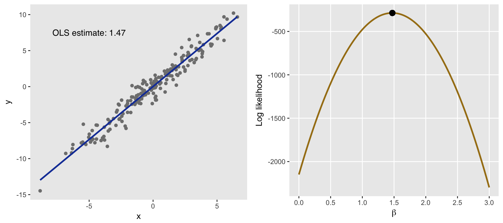
Adding variation
Now, for the pretty part. Below, I show plots of multiple likelihood functions under three scenarios. The only thing that differs across each of those scenarios is the level of variance in the error term, which is specified in \(\sigma^2\). (I have not included the code here since essentially loop through the process describe above.) If you want the code just let me know, and I will make sure to post it. I do want to highlight the fact that I used package randomcoloR to generate the colors in the plots.)
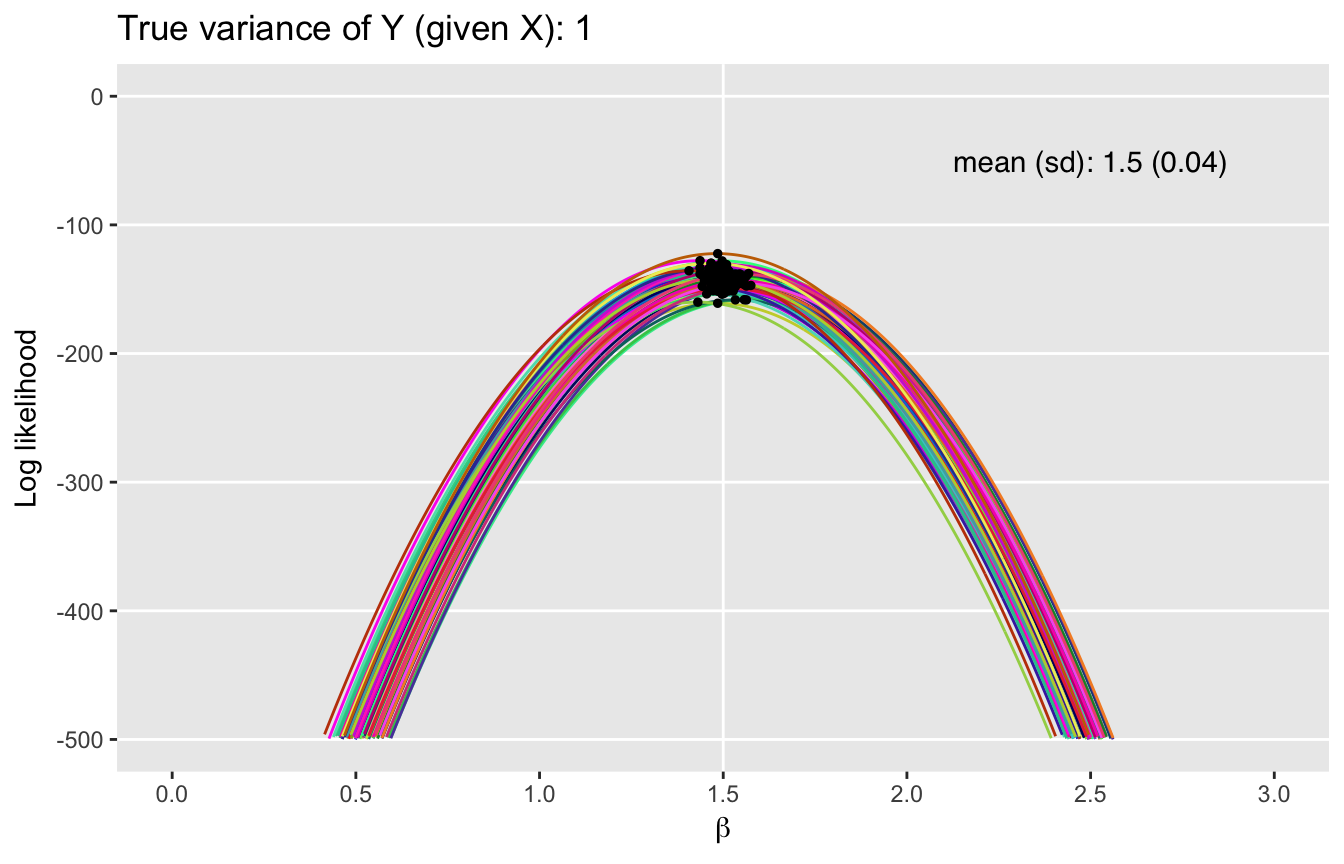
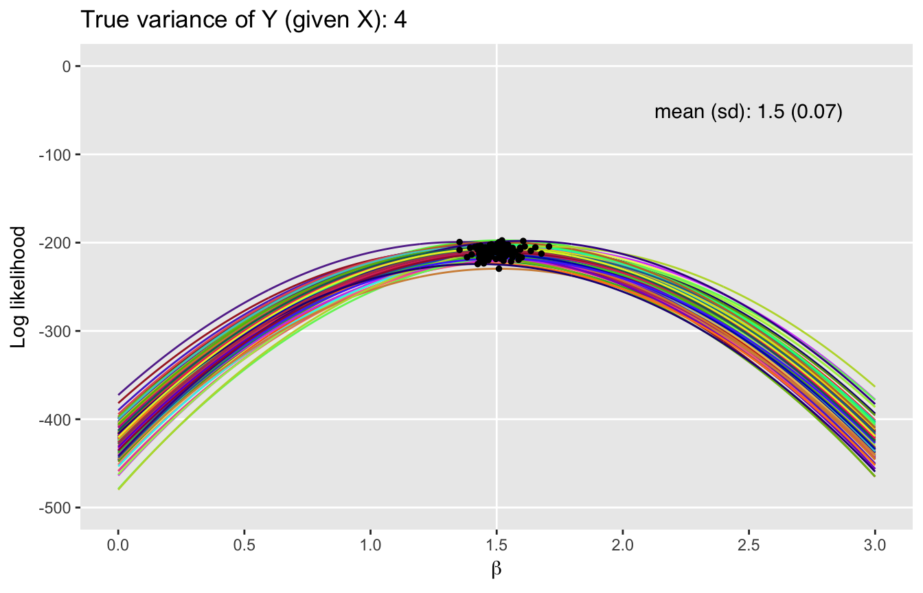
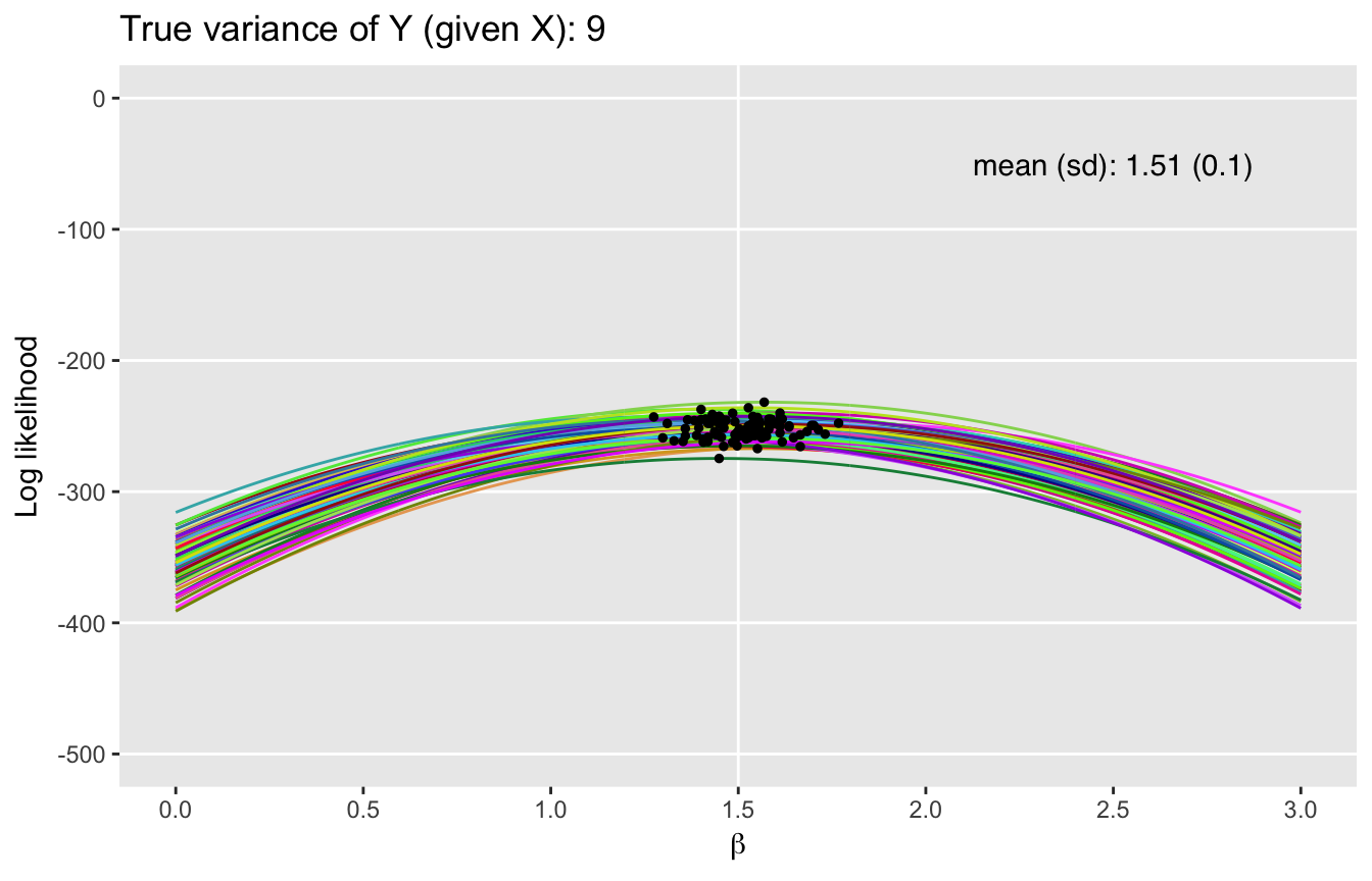
What we can see here is that as the variance increases, we move away from Mt. Everest towards the Tuscan hills. The variance of the underlying process clearly has an impact on the uncertainty of the maximum likelihood estimates. The likelihood functions flatten out and the MLEs have more variability with increased underlying variance of the outcomes \(y\). Of course, this is all consistent with maximum likelihood theory.