I just updated simstudy to version 0.1.7. It is available on CRAN.
To mark the occasion, I wanted to highlight a new function, genOrdCat, which puts into practice some code that I presented a little while back as part of a discussion of ordinal logistic regression. The new function was motivated by a reader/researcher who came across my blog while wrestling with a simulation study. After a little back and forth about how to generate ordinal categorical data, I ended up with a function that might be useful. Here’s a little example that uses the likert package, which makes plotting Likert-type easy and attractive.
Defining the data
The proportional odds model assumes a baseline distribution of probabilities. In the case of a survey item, this baseline is the probability of responding at a particular level - in this example I assume a range of 1 (strongly disagree) to 4 (strongly agree) - given a value of zero for all of the covariates. In this example, there is a single predictor \(x\) that ranges from -0.5 to 0.5. The baseline probabilities of the response variable \(r\) will apply in cases where \(x = 0\). In the proportional odds data generating process, the covariates “influence” the response through an additive shift (either positive or negative) on the logistic scale. (If this makes no sense at all, maybe check out my earlier post for a little explanation.) Here, this additive shift is represented by the variable \(z\), which is a function of \(x\).
library(simstudy)

baseprobs<-c(0.40, 0.25, 0.15, 0.20)

def <- defData(varname="x", formula="-0.5;0.5", dist = "uniform")
def <- defData(def, varname = "z", formula = "2*x", dist = "nonrandom")
Generate data
The ordinal data is generated after a data set has been created with an adjustment variable. We have to provide the data.table name, the name of the adjustment variable, and the base probabilities. That’s really it.
set.seed(2017)

dx <- genData(2500, def)
dx <- genOrdCat(dx, adjVar = "z", baseprobs, catVar = "r")
dx <- genFactor(dx, "r", c("Strongly disagree", "Disagree",
                           "Agree", "Strongly agree"))
print(dx)
## id x z r fr
## 1: 1 0.42424261 0.84848522 2 Disagree
## 2: 2 0.03717641 0.07435283 3 Agree
## 3: 3 -0.03080435 -0.06160871 3 Agree
## 4: 4 -0.21137382 -0.42274765 1 Strongly disagree
## 5: 5 0.27008816 0.54017632 1 Strongly disagree
## ---
## 2496: 2496 -0.32250407 -0.64500815 4 Strongly agree
## 2497: 2497 -0.10268875 -0.20537751 2 Disagree
## 2498: 2498 -0.17037112 -0.34074223 2 Disagree
## 2499: 2499 0.14778233 0.29556465 2 Disagree
## 2500: 2500 0.10665252 0.21330504 3 AgreeThe expected cumulative log odds when \(x=0\) can be calculated from the base probabilities:
dp <- data.table(baseprobs,
           cumProb = cumsum(baseprobs),
           cumOdds = cumsum(baseprobs)/(1 - cumsum(baseprobs))
)

dp[, cumLogOdds := log(cumOdds)]
dp
## baseprobs cumProb cumOdds cumLogOdds
## 1: 0.40 0.40 0.6666667 -0.4054651
## 2: 0.25 0.65 1.8571429 0.6190392
## 3: 0.15 0.80 4.0000000 1.3862944
## 4: 0.20 1.00 Inf InfIf we fit a cumulative odds model (using package ordinal), we recover those cumulative log odds (see the output under the section labeled “Threshold coefficients”). Also, we get an estimate for the coefficient of \(x\) (where the true value used to generate the data was 2.00):
library(ordinal)
model.fit <- clm(fr ~ x, data = dx, link = "logit")

summary(model.fit)
## formula: fr ~ x
## data: dx
##
## link threshold nobs logLik AIC niter max.grad cond.H
## logit flexible 2500 -3185.75 6379.51 5(0) 3.19e-11 3.3e+01
##
## Coefficients:
## Estimate Std. Error z value Pr(>|z|)
## x 2.096 0.134 15.64 <2e-16 ***
## ---
## Signif. codes: 0 '***' 0.001 '**' 0.01 '*' 0.05 '.' 0.1 ' ' 1
##
## Threshold coefficients:
## Estimate Std. Error z value
## Strongly disagree|Disagree -0.46572 0.04243 -10.98
## Disagree|Agree 0.60374 0.04312 14.00
## Agree|Strongly agree 1.38954 0.05049 27.52Looking at the data
Below is a plot of the response as a function of the predictor \(x\). I “jitter” the data prior to plotting; otherwise, individual responses would overlap and obscure each other.
library(ggplot2)

dx[, rjitter := jitter(as.numeric(r), factor = 0.5)]

ggplot(data = dx, aes(x = x, y = rjitter)) +
  geom_point(color = "forestgreen", size = 0.5) +
  scale_y_continuous(breaks = c(1:4),
                     labels = c("Strongly disagree", "Disagree",
                                "Agree", "Strongly Agree")) +
  theme(panel.grid.minor = element_blank(),
        panel.grid.major.x = element_blank(),
        axis.title.y = element_blank())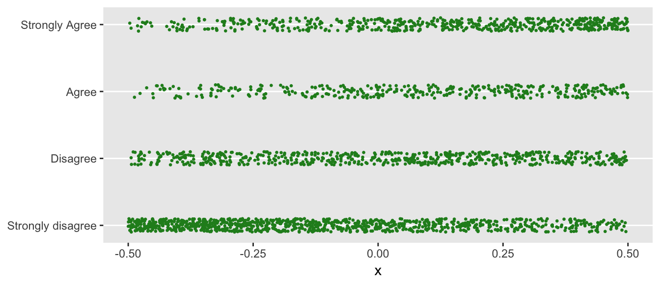
You can see that when \(x\) is smaller (closer to -0.5), a response of “Strongly disagree” is more likely. Conversely, when \(x\) is closer to +0.5, the proportion of folks responding with “Strongly agree” increases.
If we “bin” the individual responses by ranges of \(x\), say grouping by tenths, -0.5 to -0.4, -0.4 to -0.3, all the way to 0.4 to 0.5, we can get another view of how the probabilities shift with respect to \(x\).
The likert package requires very little data manipulation, and once the data are set, it is easy to look at the data in a number of different ways, a couple of which I plot here. I encourage you to look at the website for many more examples and instructions on how to download the latest version from github.
library(likert)

bins <- cut(dx$x, breaks = seq(-.5, .5, .1), include.lowest = TRUE)
dx[ , xbin := bins]

item <- data.frame(dx[, fr])
names(item) <- "r"
bin.grp <- factor(dx[, xbin])
likert.bin <- likert(item, grouping = bin.grp)
likert.bin
## Group Item Strongly disagree Disagree Agree Strongly agree
## 1 [-0.5,-0.4] r 65.63877 18.50220 7.048458 8.810573
## 2 (-0.4,-0.3] r 53.33333 27.40741 8.888889 10.370370
## 3 (-0.3,-0.2] r 52.84553 19.51220 10.975610 16.666667
## 4 (-0.2,-0.1] r 48.00000 22.80000 12.800000 16.400000
## 5 (-0.1,0] r 40.24390 24.39024 17.886179 17.479675
## 6 (0,0.1] r 35.20599 25.46816 15.355805 23.970037
## 7 (0.1,0.2] r 32.06107 27.09924 17.175573 23.664122
## 8 (0.2,0.3] r 25.00000 25.40984 21.721311 27.868852
## 9 (0.3,0.4] r 23.91304 27.39130 17.391304 31.304348
## 10 (0.4,0.5] r 17.82946 21.70543 20.155039 40.310078plot(likert.bin)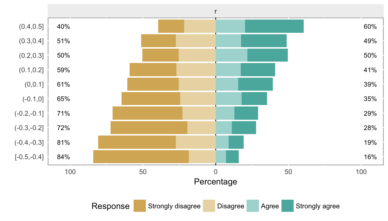
plot(likert.bin, centered = FALSE)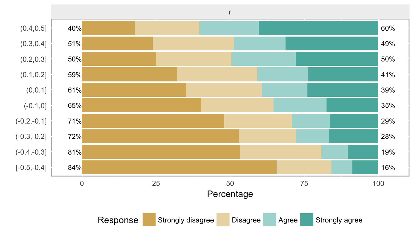
These plots show what data look like when the cumulative log odds are proportional as we move across different levels of a covariate. (Note that the two center groups should be closest to the baseline probabilities that were used to generate the data.) If you have real data, obviously it is useful to look at it first to see if this type of pattern emerges from the data. When we have more than one or two covariates, the pictures are not as useful, but then it also is probably harder to justify the proportional odds assumption.