Since this is a holiday weekend here in the US, I thought I would write up something relatively short and simple since I am supposed to be relaxing. A few weeks ago, someone presented me with some data that showed response rates to a survey that was conducted at about 30 different locations. The team that collected the data was interested in understanding if there were some sites that had response rates that might have been too low. To determine this, they generated a plot that looked something like this:
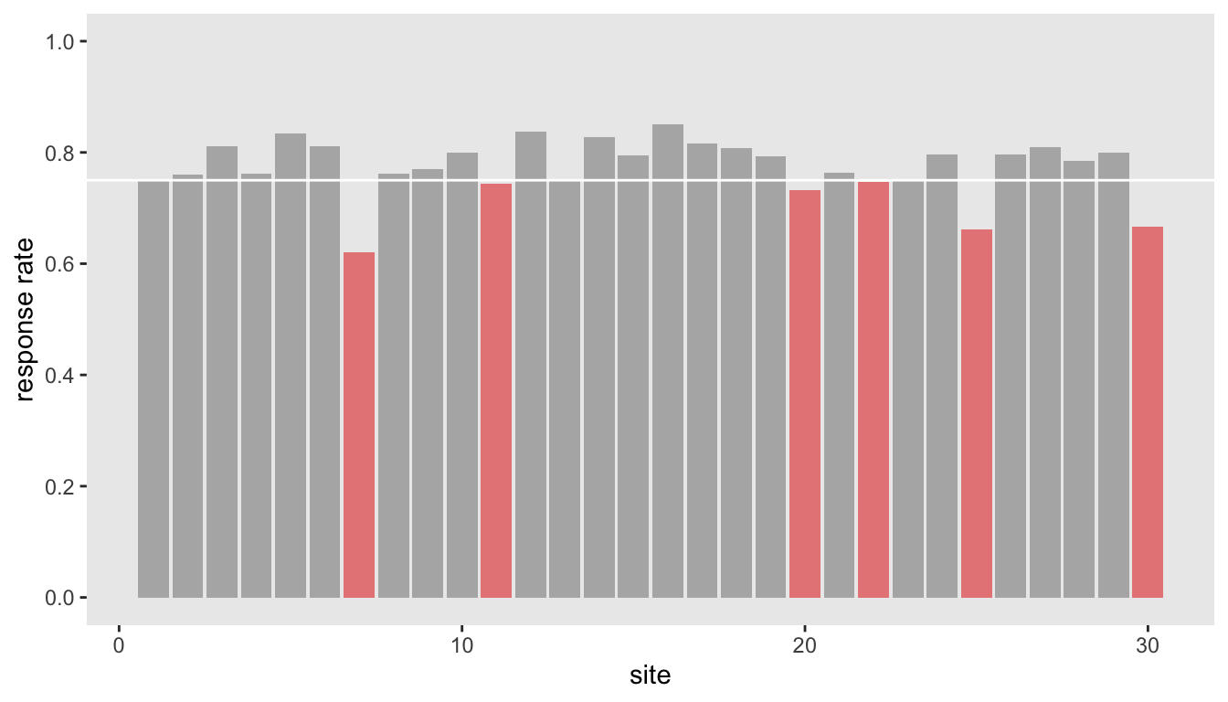
It looks like a few sites are far enough below the target threshold of 75% to merit concern. The question is, is this concern justified? Is this the best we can do to draw such a conclusion?
Actually, the data I’ve shown here are simulated under the assumption that each site has the same 80% underlying probability of response, so in truth, there is no need to be concerned that some sites are under performers; if they fell short, it was only because they were unlucky. The problem with the plot is that it ignores any uncertainty that might highlight this. I thought it would be fun to show a couple of ways how we might estimate that uncertainty for each site, and then plot those solutions.
Data simulation
The data simulation has two key elements. First, the size of the sites (i.e. the total number of possible responses) is assumed to have a negative binomial distribution with a mean \(\mu\) of 80 and dispersion parameter \(d\) set at 0.3; the average size of the sites is 80 with standard deviation of \(\sqrt{\mu + \mu^2*d} = 44.7\). This is important, because the estimates for the smaller sites should reflect more uncertainty. Second, the probability of response has a binomial distribution with mean 0.80. I am using a logit link, and the log odds ratio is \(log(.8/.2) = 1.386\). In the last step of the data generation, I’m calculating the observed probability of response \(p\):
library(ggplot2)
library(simstudy)
library(data.table)
library(cmdstanr)
library(posterior)
library(bayesplot)
library(ggdist)
library(gtsummary)

def <- defData(varname = "n", formula = 80, variance = .3, dist="negBinomial")
def <- defData(def, varname = "y", formula = 1.386,
          variance = "n", link = "logit", dist = "binomial")
def <- defData(def, varname = "p", formula = "y/n", dist = "nonrandom")

set.seed(4601)
dd <- genData(30, def, id = "site")
We can fit a generalized linear model with just an intercept to show that we can recover the log odds used to generate the data. Note that in the glm modeling statement, we are modeling the responses and non-responses in aggregate form, as opposed to individual 1’s and 0’s:
fit1 <- glm(cbind(y, n - y) ~ 1, data = dd, family = "binomial")

tbl_regression(fit1, intercept = TRUE)| Characteristic | log(OR)1 | 95% CI1 | p-value |
|---|---|---|---|
| (Intercept) | 1.3 | 1.2, 1.4 | <0.001 |
|
1
OR = Odds Ratio, CI = Confidence Interval
|
|||
It is easy to recover the estimated probability by extracting the parameter estimate for the log odds (lodds) and converting it to a probability using
\[p = \frac{1}{1 + e^{(-lodds)}}\]
lOR <- coef(summary(fit1))[1]
1/(1+exp(-lOR))
## [1] 0.78And here is a 95% confidence interval for the estimated probability:
ci <- data.table(t(confint(fit1)))
setnames(ci, c("l95_lo", "u95_lo"))
ci[, .(1/(1+exp(-l95_lo)), 1/(1+exp(-u95_lo)))]
## V1 V2
## 1: 0.76 0.8For completeness, here is the observed probability:
with(dd, sum(y)/sum(n))## [1] 0.78Site-specific probabilities
So far what we’ve done doesn’t really help us with getting at the site-level estimates. One way to do this is to fit the same model, but with site-specific intercepts.
fit2 <- glm(cbind(y, n - y) ~ factor(site) - 1, data = dd, family = "binomial")Just as before we can get point estimates and 95% confidence intervals for each location based on the model’s estimated site-specific log odds.
sites <- rownames(coef(summary(fit2)))
p_est <- 1/(1 + exp(-coef(summary(fit2))[,"Estimate"]))

ci <- data.table(confint(fit2))
setnames(ci, c("l95_lo", "u95_lo"))
ci[, `:=`(l95_p = 1/(1+exp(-l95_lo)), u95_p = 1/(1+exp(-u95_lo)))]
Plotting the point estimates with confidence intervals gives us a slightly different picture than the initial bar plot. The outliers at the bottom all have confidence intervals that cross the desired 75% threshold, suggesting that any differences might be due to chance.
dp <- data.table(sites, p_est, ci[, .(l95_p, u95_p)])

setkey(dp, p_est)
dp[, index := .I]

ggplot(data = dp, aes(x = p_est, y = index)) +
  geom_vline(xintercept = 0.75, color = "white", size = .8) +
  geom_point(size = .8, color = "#23518e") +
  geom_segment(aes(x = l95_p, xend = u95_p, yend = index),
               color = "grey40", size = .2) +
  theme(panel.grid = element_blank(),
        axis.text.y= element_blank(),
        axis.ticks.y = element_blank(),
        plot.title = element_text(size = 11, face = "bold")) +
  scale_x_continuous(limits = c(0.2,1), breaks = seq(0.2,1, by = 0.2),
                     name = "response rate") +
  ylab("site")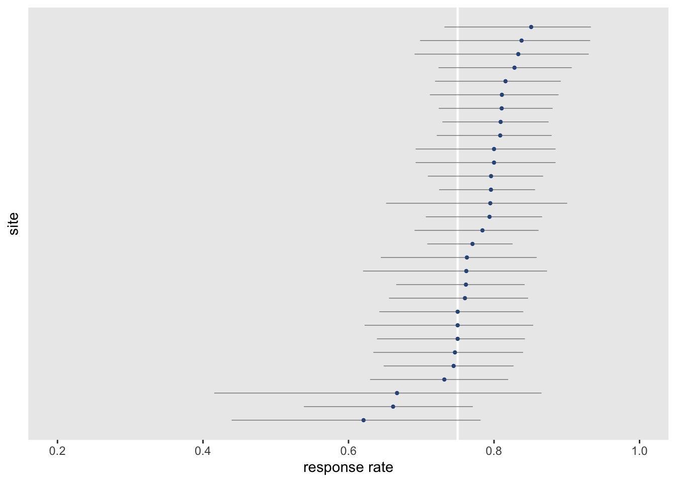
Bayesian estimation
This problem also lends itself very nicely to a hierarchical Bayesian approach, which is the second estimation method that we’ll use here. Taking this approach, we can assume that each site \(s\) has its own underlying response probability \(\theta_s\), and these probabilities are drawn from a common Beta distribution (where values range from 0 to 1) with unknown parameters \(\alpha\) and \(\beta\):
\[\theta_s \sim Beta(\alpha, \beta), \ \ s \in \{1,2,\dots,30\}\]
The model is implemented easily in Stan. The output of the model is joint distribution of \(\alpha\), \(\beta\), the \(\theta_s\text{'s}\), and \(\mu\). \(\mu\) is really the overall mean response rate based on the Beta distribution parameter estimates for \(\alpha\) and \(\beta\):
\[\mu = \frac{\alpha}{\alpha + \beta}\]
Here is the Stan implementation:
data {
  int<lower=0> S;
  int<lower=0> y[S]; // numerator
  int<lower=0> n[S]; // total observations (denominator)
}

parameters {
  real<lower=0,upper=1> theta[S];
  real<lower=0> alpha;
  real<lower=0> beta;
}

model {
  alpha ~ normal(0, 10);
  beta ~ normal(0, 10);

  theta ~ beta(alpha, beta);

  y ~ binomial(n, theta);
}

generated quantities {
  real mu;
  mu = alpha/(alpha + beta);
}
The Stan model is compiled and sampled using the cmdstanr package. I’m generating 20,000 samples (using 4 chains), following a warm-up of 1,000 samples in each of the chains.
mod <- cmdstan_model("code/binom.stan")

data_list <- list(S = nrow(dd), y = dd$y, n = dd$n)

fit <- mod$sample(
  data = data_list,
  refresh = 0,
  chains = 4L,
  parallel_chains = 4L,
  iter_warmup = 1000,
  iter_sampling = 5000,
  show_messages = FALSE
)
## Running MCMC with 4 parallel chains...
##
## Chain 1 finished in 0.5 seconds.
## Chain 3 finished in 0.5 seconds.
## Chain 4 finished in 0.5 seconds.
## Chain 2 finished in 0.5 seconds.
##
## All 4 chains finished successfully.
## Mean chain execution time: 0.5 seconds.
## Total execution time: 0.6 seconds.Here are summary statistics for the key parameters \(\alpha\), \(\beta\), and \(\mu\). I’ve also included estimates of \(\theta_s\) for two of the sites:
fit$summary(c("alpha", "beta", "mu","theta[1]", "theta[3]"))## # A tibble: 5 × 10
## variable mean median sd mad q5 q95 rhat ess_bulk ess_tail
## <chr> <dbl> <dbl> <dbl> <dbl> <dbl> <dbl> <dbl> <dbl> <dbl>
## 1 alpha 28.2 27.9 6.13 6.24 18.6 38.7 1.00 10819. 11066.
## 2 beta 8.48 8.37 1.87 1.89 5.58 11.7 1.00 10217. 11486.
## 3 mu 0.768 0.769 0.0158 0.0156 0.742 0.794 1.00 18130. 16541.
## 4 theta[1] 0.756 0.758 0.0424 0.0427 0.683 0.823 1.00 28870. 15269.
## 5 theta[3] 0.797 0.799 0.0389 0.0388 0.730 0.858 1.00 25294. 14662.And finally, we can plot the site-specific estimates of \(\theta_s\), showing the median and 95% credible intervals of the posterior distribution. This biggest difference between this plot and the one above based on the generalized linear model is that the medians seem to shrink towards the common median and the credible intervals are narrower. Even the smaller sites have narrower credible intervals, because the estimates are pooling information across the sites.
In the end, we would draw the same conclusions either way: we have no reason to believe that any sites are under performing.
post_array <- fit$draws()

df <- data.frame(as_draws_rvars(fit$draws(variables = "theta")))
df$index <- rank(median(df$theta))

ggplot(data = df, aes(dist = theta, y = index)) +
  geom_vline(xintercept = 0.75, color = "white", size = .8) +
  stat_dist_pointinterval(.width = c(.95),
                          point_color = "#23518e",
                          interval_color = "grey80",
                          interval_size = 1,
                          point_size = .4) +
  theme(panel.grid = element_blank(),
        axis.text.y= element_blank(),
        axis.ticks.y = element_blank(),
        plot.title = element_text(size = 11, face = "bold")) +
  scale_x_continuous(limits = c(0.2,1), breaks = seq(0.2,1, by = 0.2),
                     name = "response rate") +
  ylab("site")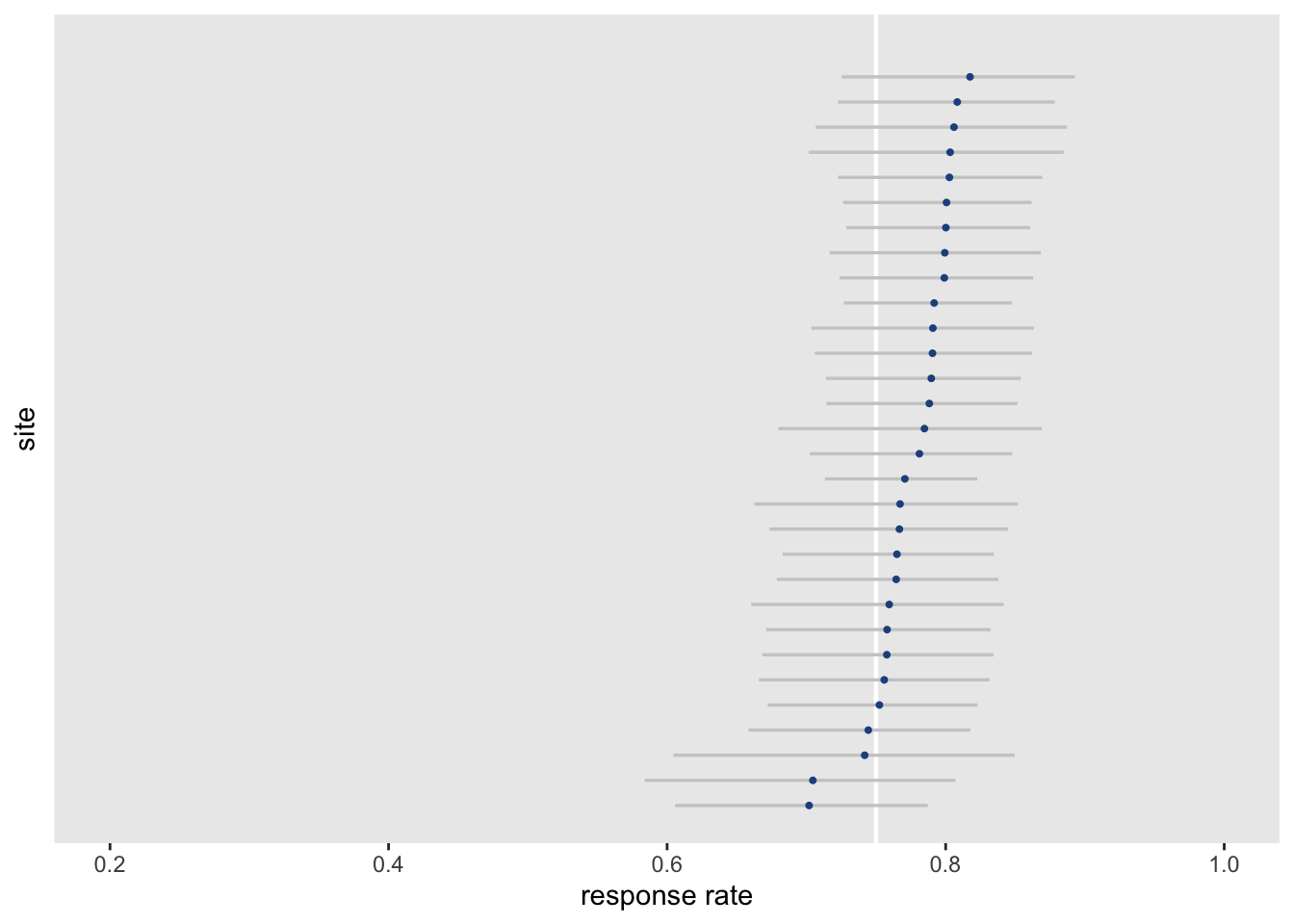
I did conduct some simulations where there were actually true underlying differences between the sites, but to keep this post more manageable, I will not include that here - I leave that data generation to you as an exercise.