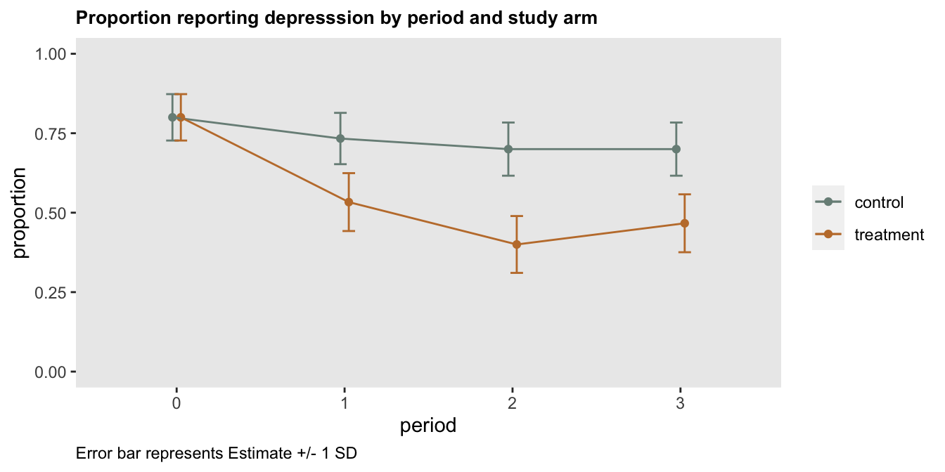
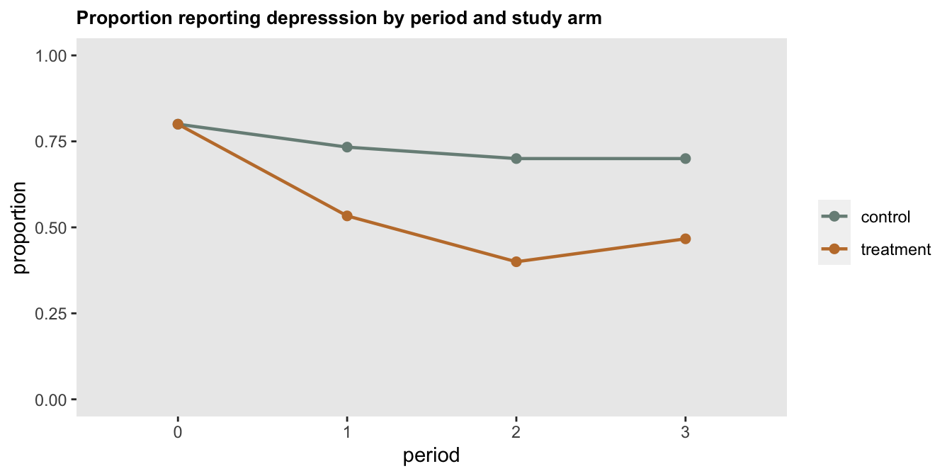
I recently created a simple plot for a paper describing a pilot study of an intervention targeting depression. This small study was largely conducted to assess the feasibility and acceptability of implementing an existing intervention in a new population. The primary outcome measure that was collected was the proportion of patients in each study arm who remained depressed following the intervention. The plot of the study results that we included in the paper looked something like this:
The motivation for showing the data in this form was simply to provide a general sense of the outcome patterns we observed, even though I would argue (and I have argued) that one shouldn’t try to use a small pilot to draw strong conclusions about a treatment effect, or maybe any conclusions at all. The data are simply too noisy. However, it does seem useful to show data that suggest an intervention might move things in the right direction (or least not in the wrong direction). I would have been fine showing this plot along with a description of the feasibility outcomes and plans for a future bigger trial that is designed to actually measure the treatment effect and allow us to draw stronger conclusions.
Of course, some journals have different priorities and might want to make stronger statements about the research they publish. Perhaps with this in mind, a reviewer suggested that we include 95% confidence intervals around the point estimates to give a more complete picture. In that case the figure would have looked something like this:
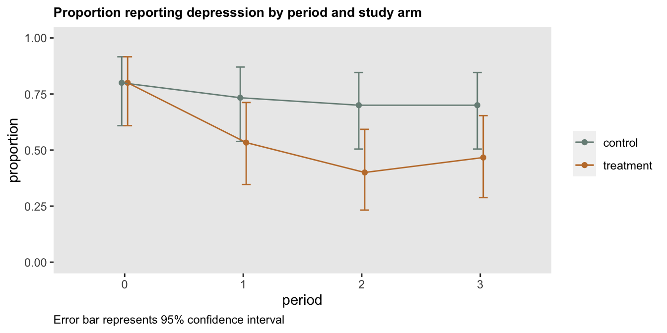
When I shared this plot with my collaborators, it generated a bit of confusion. They had done a test comparing two proportions at period 2 and found a “significant” difference between the two arms. The p-value was 0.04, and the 95% confidence interval for the difference in proportions was [0.03, 0.57], which excludes 0:
prop.test(x = c(21, 12), n=c(30, 30), correct = TRUE)##
## 2-sample test for equality of proportions with continuity correction
##
## data: c(21, 12) out of c(30, 30)
## X-squared = 4, df = 1, p-value = 0.04
## alternative hypothesis: two.sided
## 95 percent confidence interval:
## 0.027 0.573
## sample estimates:
## prop 1 prop 2
## 0.7 0.4Does it make sense that the 95% CIs for the individual proportions overlap while at the same time there does appear to be a real difference between the two groups (at least in this crude way, without making adjustments for multiple testing or considering the possibility that there might be differences in the two groups)? Well - there’s actually no real reason to think that this is a paradox. The two different types of confidence intervals are measuring very different quantities - one set is looking at individual proportions, and the other is looking at the difference in proportions.
I thought a simple way to show this non-paradox would be to generate all the possible confidence intervals and p-values for a case where we have 30 patients per arm, and create a plot to show how overlapping individual confidence intervals for the proportions relate to p-values based on a comparison of those proportions.
I’ve created a data set that is a grid of events, where I am only interested in cases where the number of “events” (e.g. individuals with depression) in the intervention arm is less than the number in the control arm.
N <- 30
e0 <- c(5:(N-5))
e1 <- c(5:(N-5))

dd <- data.table(expand.grid(e0 = e0, e1 = e1))
dd <- dd[e1 < e0]
dd[, id := 1:.N]

dd
## e0 e1 id
## 1: 6 5 1
## 2: 7 5 2
## 3: 8 5 3
## 4: 9 5 4
## 5: 10 5 5
## ---
## 206: 24 22 206
## 207: 25 22 207
## 208: 24 23 208
## 209: 25 23 209
## 210: 25 24 210For each pair of possible outcomes, I am estimating the confidence interval for each proportion. If the upper limit of intervention arm 95% CI is greater than the lower limit of the control arm 95% CI, the two arms overlap. (Look back at the confidence interval plot to make sure this makes sense.)
ci <- function(x, n) {
  data.table(t(prop.test(x = x, n = n, correct = T)$conf.int))
}

de0 <- dd[, ci(e0, N), keyby = id]
de0 <- de0[, .(L_e0 = V1, U_e0 = V2)]

de1 <- dd[, ci(e1, N), keyby = id]
de1 <- de1[, .(L_e1 = V1, U_e1 = V2)]

dd <- cbind(dd, de0, de1)
dd[, overlap := factor(U_e1 >= L_e0, labels = c("no overlap", "overlap"))]
In the next and last step, I am getting the p-value for a comparison of the proportions in each pair. Any p-value less than the cutoff of 5% is considered significant.
cidif <- function(x, n) {
  prop.test(x = x, n = n, correct = T)$p.value
}

dd[, pval := cidif(x = c(e1, e0), n = c(N, N)), keyb = id]
dd[, sig := factor(pval < 0.05, labels = c("not significant","significant"))]
The plot shows each pair color coded as to whether there is overlap and the difference is statistically significant.
library(paletteer)

ggplot(data=dd, aes(x = e0, y = e1)) +
  geom_point(aes(color = interaction(overlap, sig)), size = 3, shape =15) +
  theme(panel.grid = element_blank(),
        legend.title = element_blank()) +
  scale_color_paletteer_d(
    palette = "wesanderson::Moonrise2",
    breaks=c("overlap.not significant", "overlap.significant", "no overlap.significant")
  ) +
  scale_x_continuous(limits=c(5, 25), name = "number of events in control arm") +
  scale_y_continuous(limits=c(5, 25), name = "number of events in treatment arm")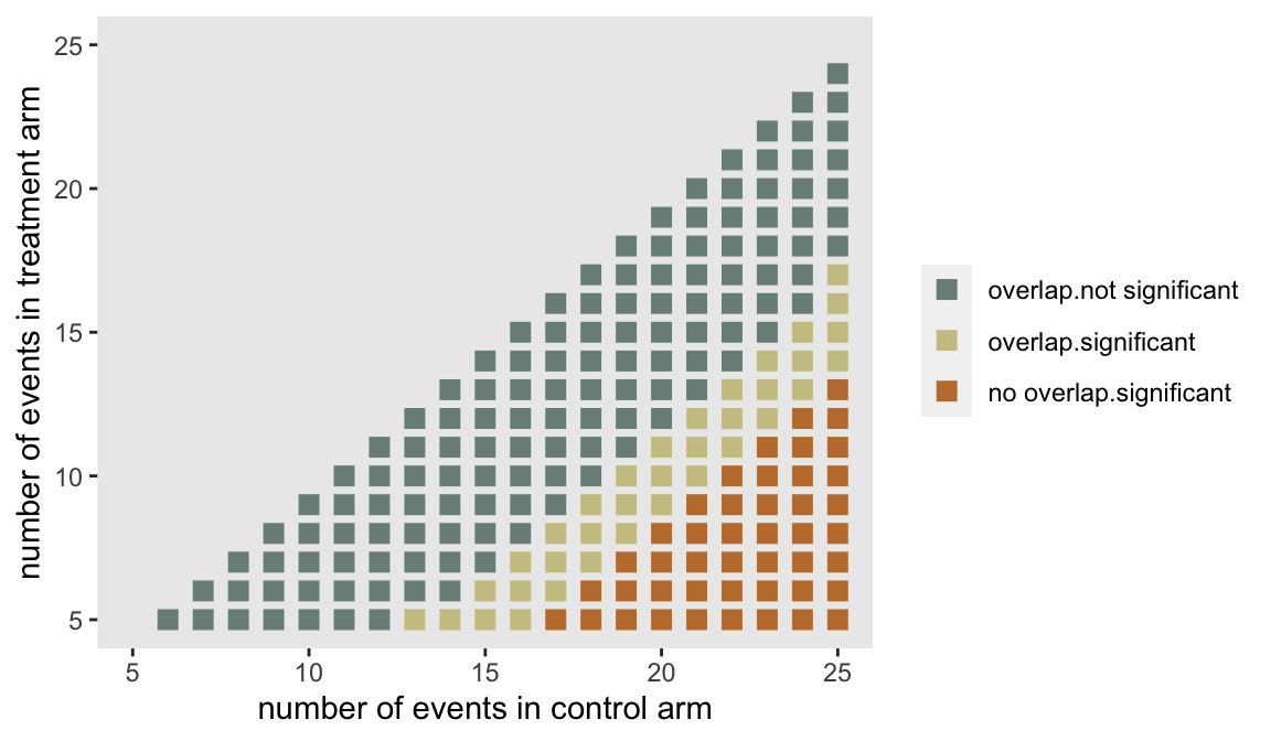
The blue points in the center represent outcomes that are relatively close; there is overlap in the individual 95% CIs and the results are not significant. The rust points in the lower right-hand corner represent outcomes where differences are quite large; there is no overlap and the results are significant. (It will always be the case that if there is no overlap in the individual 95% CIs, the differences will be significant, at least before making adjustments for multiplicity, etc.) The region of gold points is where the ambiguity lies, outcomes where there is overlap between the individual 95% CIs but the differences are indeed statistically significant.
The following plot focuses on a single row from the grid plot above. Fixing the number of events in the treatment arm to 10, the transition from (a) substantial overlap and non-significance to (b) less overlap and significance to (c) complete separation and significance is made explicit.
d10 <- dd[e1==10]
d10 <- melt(
  data = d10,
  id.vars = c("e0","e1", "sig", "overlap"),
  measure.vars = list(c("L_e0", "L_e1"), c("U_e0", "U_e1")),
  value.name = c("L","U")
)

ggplot(data = d10, aes(x = factor(e0), ymin = L, ymax = U)) +
  geom_errorbar(aes(group = "variable",
                    color=interaction(overlap, sig)
                ),
                width = .4,
                size = 1,
                position = position_dodge2()) +
  theme(panel.grid = element_blank(),
        legend.title = element_blank(),
        plot.title = element_text(size = 10, face = "bold")) +
  scale_color_paletteer_d(
    palette = "wesanderson::Moonrise2",
    breaks=c("overlap.not significant", "overlap.significant", "no overlap.significant")
  ) +
  scale_y_continuous(limits = c(0, 1), name = "proportion with events") +
  xlab("number of events in control arm") +
  ggtitle("Comparison of 95% CIs and significance - treatment arm fixed at 10 events")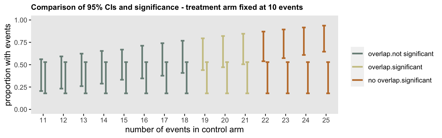
Where does this leave us? I think including the 95% CIs for the individual proportions is not really all that helpful, because there is that area of ambiguity. (Not to mention the fact that I think we should be de-emphasizing the p-values while reporting the results of a pilot.)
In this case, I am fine with the original plot, but, it is possible to provide an alternative measure of uncertainty by including error bars defined by the sample standard deviation. While doing this is typically more interesting in the context of continuous outcomes, it does give a sense of the sampling variability, which in the case of proportions is largely driven by the sample size. If you do decide to go this route, make sure to label the plot clearly to indicate what the error bars represent (so readers don’t think they are something they are not, such as 95% CIs).