I was just going to make a quick announcement to let folks know that I’ve updated the simstudy package to version 0.1.4 (now available on CRAN) to include functions that allow conversion of columns to factors, creation of dummy variables, and most importantly, specification of outcomes that are more flexibly conditional on previously defined variables. But, as I was coming up with an example that might illustrate the added conditional functionality, I found myself playing with package flexmix, which uses an Expectation-Maximization (EM) algorithm to estimate latent classes and fit regression models. So, in the end, this turned into a bit more than a brief service announcement.
Defining data conditionally
Of course, simstudy has always enabled conditional distributions based on sequentially defined variables. That is really the whole point of simstudy. But, what if I wanted to specify completely different families of distributions or very different regression curves based on different individual characteristics? With the previous version of simstudy, it was not really easy to do. Now, with the addition of two key functions, defCondition and addCondition the process is much improved. defCondition is analogous to the function defData, in that this new function provides an easy way to specify conditional definitions (as does defReadCond, which is analogous to defRead). addCondition is used to actually add the data column, just as addColumns adds columns.
It is probably easiest to see in action:
library(simstudy)

# Define baseline data set

def <- defData(varname="x", dist="normal", formula=0, variance=9)
def <- defData(def, varname = "group", formula = "0.2;0.5;0.3",
               dist = "categorical")

# Generate data

set.seed(111)

dt <- genData(1000, def)

# Convert group to factor - new function

dt <- genFactor(dt, "group", replace = TRUE)
dt
defCondition is the same as defData, except that instead of specifying a variable name, we need to specify a condition that is based on a pre-defined field:
defC <- defCondition(condition = "fgroup == 1", formula = "5 + 2*x",
                     variance = 4, dist = "normal")
defC <- defCondition(defC, condition = "fgroup == 2", formula = 4,
                     variance = 3, dist="normal")
defC <- defCondition(defC, condition = "fgroup == 3", formula = "3 - 2*x",
                     variance = 2, dist="normal")

defC
## condition formula variance dist link
## 1: fgroup == 1 5 + 2*x 4 normal identity
## 2: fgroup == 2 4 3 normal identity
## 3: fgroup == 3 3 - 2*x 2 normal identityA subsequent call to addCondition generates a data table with the new variable, in this case \(y\):
dt <- addCondition(defC, dt, "y")

dt
## id y x fgroup
## 1: 1 5.3036869 0.7056621 2
## 2: 2 2.1521853 -0.9922076 2
## 3: 3 4.7422359 -0.9348715 3
## 4: 4 16.1814232 -6.9070370 3
## 5: 5 4.3958893 -0.5126281 3
## ---
## 996: 996 -0.8115245 -2.7092396 1
## 997: 997 1.9946074 0.7126094 2
## 998: 998 11.8384871 2.3895135 1
## 999: 999 3.3569664 0.8123200 1
## 1000: 1000 3.4662074 -0.4653198 3In this example, I’ve partitioned the data into three subsets, each of which has a very different linear relationship between variables \(x\) and \(y\), and different variation. In this particular case, all relationships are linear with normally distributed noise, but this is absolutely not required.
Here is what the data look like:
library(ggplot2)

mycolors <- c("#555bd4","#d4555b","#d4ce55")

ggplot(data = dt, aes(x = x, y = y, group = fgroup)) +
  geom_point(aes(color = fgroup), size = 1, alpha = .4) +
  geom_smooth(aes(color = fgroup), se = FALSE, method = "lm") +
  scale_color_manual(name = "Cluster", values = mycolors)  +
  scale_x_continuous(limits = c(-10,10), breaks = c(-10, -5, 0, 5, 10)) +
  theme(panel.grid = element_blank(),
        panel.background = element_rect(fill = "grey96", color = "grey80"))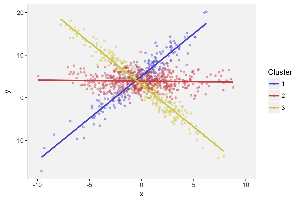
Latent class regression models
Suppose we come across the same data set, but are not privy to the group classification, and we are still interested in the relationship between \(x\) and \(y\). This is what the data set would look like - not as user-friendly:
rawp <- ggplot(data = dt, aes(x = x, y = y, group = fgroup)) +
  geom_point(color = "grey75", size = .5) +
  scale_x_continuous(limits = c(-10,10), breaks = c(-10, -5, 0, 5, 10)) +
  theme(panel.grid = element_blank(),
        panel.background = element_rect(fill = "grey96", color = "grey80"))

rawp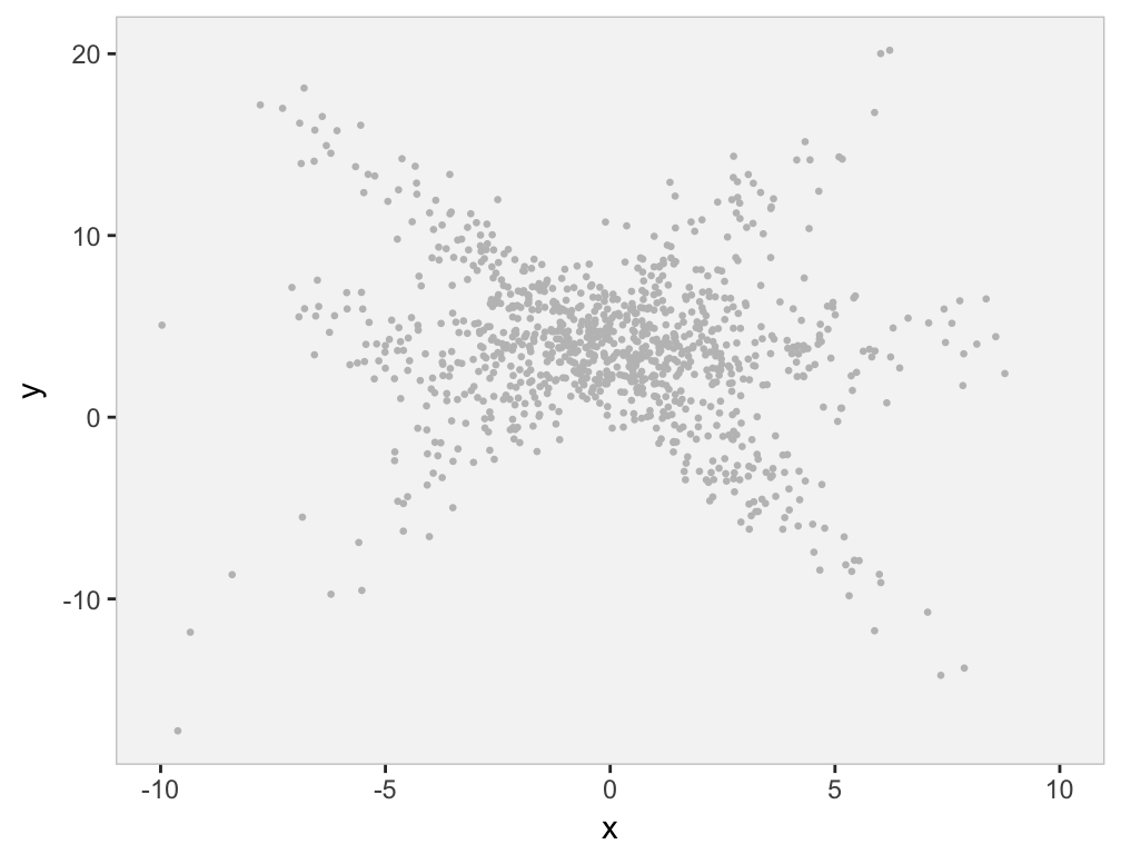
We might see from the plot, or we might have some subject-matter knowledge that suggests there are are several sub-clusters within the data, each of which appears to have a different relationship between \(x\) and \(y\). (Obviously, we know this is the case, since we generated the data.) The question is, how can we estimate the regression lines if we don’t know the class membership? That is where the EM algorithm comes into play.
The EM algorithm, very, very briefly
The EM algorithm handles model parameter estimation in the context of incomplete or missing data. In the example I’ve been discussing here, the subgroups or cluster membership are the missing data. There is an extensive literature on EM methods (starting with this article by Dempster, Laird & Rubin), and I am barely even touching the surface, let alone scratching it.
The missing data (cluster memberships) are estimated in the Expectation- or E-step. These are replaced with their expected values as given by the posterior probabilities. The mixture model assumes that each observation is exactly from one cluster, but this information has not been observed. The unknown model parameters (intercept, slope, and variance) for each of the clusters is estimated in the Maximization- or M-step, which in this case assumes the data come from a linear process with normally distributed noise - both the linear coefficients and variation around the line are conditional on cluster membership. The process is iterative. First, the E-step, which is based on some starting model parameters at first and then updated with the most recent parameter estimates from the prior M-step. Second, the M-step is based on estimates of the maximum likelihood of all the data (including the ‘missing’ data estimated in the prior E-step). We iterate back and forth until the parameter estimates in the M-step reach a steady state, or the overal likelihood estimate becomes stable.
The strength or usefulness of the EM method is that the likelihood of the full data (both observed data - \(x\)’s and \(y\)’s - and unobserved data - cluster probabilities) is much easier to write down and estimate than the likelihood of the observed data only (\(x\)’s and \(y\)’s). Think of the first plot above with the structure given by the colors compared to the second plot in grey without the structure. The first seems so much more manageable than the second - if only we knew the underlying structure defined by the clusters. The EM algorithm builds the underlying structure so that the maximum likelihood estimation problem becomes much easier.
Here is a little more detail on what the EM algorithm is estimating in our application. (See this for the much more detail.) First, we estimate the probability of membership in cluster \(j\) for our linear regression model with three clusters:
\[P_i(j|x_i, y_i, \mathbf{\pi}, \mathbf{\alpha_0}, \mathbf{\alpha_1}, \mathbf{\sigma}) = p_{ij}= \frac{\pi_jf(y_i|x_i, \mathbf{\alpha_0}, \mathbf{\alpha_1}, \mathbf{\sigma})}{\sum_{k=1}^3 \pi_k f(y_i|x_i, \mathbf{\alpha_0}, \mathbf{\alpha_1}, \mathbf{\sigma})},\] where \(\mathbf{\alpha_0}\), \(\mathbf{\alpha_1}\), and \(\mathbf{\sigma}\) are the vectors of intercepts, slopes, and standard deviations for the three clusters. \(\pi\) is the vector of probabilities that any individual is in the respective clusters, and each \(\pi_j\) is estimated by averaging the \(p_{ij}\)’s across all individuals. Finally, \(f(.|.)\) is the density from the normal distribution \(N(\alpha_{j0} + \alpha_{j1}x, \sigma_j^2)\), with cluster-specific parameters.
Second, we maximize each of the three cluster-specific log-likelihoods, where each individual is weighted by its probability of cluster membership (which is \(P_i(j)\), estimated in the E-step). In particular, we are maximizing the cluster-specific likelihood with respect to the three unknown parameters \(\alpha_{j0}\), \(\alpha_{j1}\), and \(\sigma_j\):
\[\sum_{n=1}^N \hat{p}_{nk} \text{log} (f(y_n|x_n,\alpha_{j0},\alpha_{j1},\sigma_j)\] In R, the flexmix package has implemented an EM algorithm to estimate latent class regression models. The package documentation provides a really nice, accessible description of the two-step procedure, with much more detail than I have provided here. I encourage you to check it out.
Iterating slowly through the EM algorithm
Here is a slow-motion version of the EM estimation process. I show the parameter estimates (visually) at the early stages of estimation, checking in after every three steps. In addition, I highlight two individuals and show the estimated probabilities of cluster membership. At the beginning, there is little differentiation between the regression lines for each cluster. However, by the 10th iteration the parameter estimates for the regression lines are looking pretty similar to the original plot.
library(flexmix)

selectIDs <- c(508, 775) # select two individuals

ps <- list()
count <- 0
p.ij <- data.table()  # keep track of estimated probs
pi.j <- data.table()  # keep track of average probs

for (i in seq(1,10, by=3)) {

  count <- count + 1
  set.seed(5)

  # fit model up to "i" iterations - either 1, 4, 7, or 10

  exMax <- flexmix(y ~ x,
                   data = dt, k = 3,
                   control = list(iter.max = i)
  )

  p.ij <- rbind(p.ij,
                data.table(i, selectIDs, posterior(exMax)[selectIDs,]))
  pi.j <- rbind(pi.j,
                data.table(i, t(apply(posterior(exMax), 2, mean))))

  dp <- as.data.table(t(parameters(exMax)))
  setnames(dp, c("int","slope", "sigma"))

  # flexmix rearranges columns/clusters

  dp[, grp := c(3, 1, 2)]
  setkey(dp, grp)

  # create plot for each iteration

  ps[[count]] <- rawp +
    geom_abline(data = dp, aes(intercept = int, slope = slope,
                               color=factor(grp)), size = 1) +
    geom_point(data = dt[id %in% selectIDs], color = "black") +
    scale_color_manual(values = mycolors)  +
    ggtitle(paste("Iteration", i)) +
    theme(legend.position = "none",
          plot.title = element_text(size = 9))


}
library(gridExtra)
grid.arrange(ps[[1]], ps[[2]], ps[[3]], ps[[4]], nrow = 1)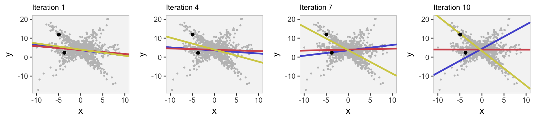
For the two individuals, we can see the probabilities converging to a level of certainty/uncertainty. The individual with ID #775 lies right on the regression line for cluster 3, far from the other lines, and the algorithm quickly assigns a probability of 100% to cluster 3 (its actual cluster). The cluster assignment is less certain for ID #508, which lies between the two regression lines for clusters 1 and 2.
# actual cluster membership

dt[id %in% selectIDs, .(id, fgroup)]
## id fgroup
## 1: 508 2
## 2: 775 3setkey(p.ij, selectIDs, i)
p.ij[, .(selectIDs, i, C1 = round(V2, 2), C2 = round(V3,2), C3 = round(V1,2))]## selectIDs i C1 C2 C3
## 1: 508 1 0.32 0.36 0.32
## 2: 508 4 0.29 0.44 0.27
## 3: 508 7 0.25 0.65 0.10
## 4: 508 10 0.24 0.76 0.00
## 5: 775 1 0.35 0.28 0.37
## 6: 775 4 0.33 0.14 0.53
## 7: 775 7 0.11 0.01 0.88
## 8: 775 10 0.00 0.00 1.00In addition, we can see how the estimate of overall group membership (for all individuals) changes through the iterations. The algorithm starts by assigning equal probability to each cluster (1/3) and slowly moves towards the actual distribution used to generate the data (20%, 50%, and 30%).
pi.j[, .(i, C1 = round(V2, 2), C2 = round(V3,2), C3 = round(V1,2))]## i C1 C2 C3
## 1: 1 0.33 0.34 0.33
## 2: 4 0.31 0.34 0.35
## 3: 7 0.25 0.39 0.36
## 4: 10 0.23 0.44 0.33Final estimation of linear models
The final estimation is shown below, and we can see that the parameters have largely converged to the values used to generate the data.
# Estimation until convergence

set.seed(5)
ex1 <- flexmix(y ~ x, data = dt, k = 3)

# paramter estimates

data.table(parameters(ex1))[, .(param = c("int", "slope", "sd"),
                                C1 = round(Comp.2, 2),
                                C2 = round(Comp.3, 2),
                                C3 = round(Comp.1, 2))]
## param C1 C2 C3
## 1: int 5.18 3.94 3.00
## 2: slope 1.97 -0.03 -1.99
## 3: sd 2.07 1.83 1.55# estimates of cluster probabilities
round(apply(posterior(ex1), 2, mean), 2)[c(2,3,1)]## [1] 0.19 0.51 0.30# estimates of individual probabilities
data.table(posterior(exMax)[selectIDs,])[,.(selectIDs,
C1 = round(V2, 2),
C2 = round(V3, 2),
C3 = round(V1, 2))]## selectIDs C1 C2 C3
## 1: 508 0.24 0.76 0
## 2: 775 0.00 0.00 1How do we know the relationship is linear?
In reality, there is no reason to assume that the relationship between \(x\) and \(y\) is simply linear. We might want to look at other possibilities, such as a quadratic relationship. So, we use flexmix to estimate an expanded model, and then we plot the fitted lines on the original data:
ex2 <- flexmix(y ~ x + I(x^2), data = dt, k = 3)
dp <- as.data.table(t(parameters(ex2)))
setnames(dp, c("int","slope", "slope2", "sigma"))

dp[, grp := c(1,2,3)]

x <- c(seq(-10,10, by =.1))

dp1 <- data.table(grp = 1, x, dp[1, int + slope*x + slope2*(x^2)])
dp2 <- data.table(grp = 2, x, dp[2, int + slope*x + slope2*(x^2)])
dp3 <- data.table(grp = 3, x, dp[3, int + slope*x + slope2*(x^2)])

dp <- rbind(dp1, dp2, dp3)

rawp +
  geom_line(data=dp, aes(x=x, y=V3, group = grp, color = factor(grp)),
            size = 1) +
  scale_color_manual(values = mycolors)  +
  theme(legend.position = "none")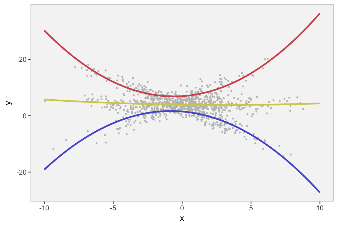
And even though the parameter estimates appear to be reasonable, we would want to compare the simple linear model with the quadratic model, which we can use with something like the BIC. We see that the linear model is a better fit (lower BIC value) - not surprising since this is how we generated the data.
summary(refit(ex2))## $Comp.1
## Estimate Std. Error z value Pr(>|z|)
## (Intercept) 1.440736 0.309576 4.6539 3.257e-06 ***
## x -0.405118 0.048808 -8.3003 < 2.2e-16 ***
## I(x^2) -0.246075 0.012162 -20.2337 < 2.2e-16 ***
## ---
## Signif. codes: 0 '***' 0.001 '**' 0.01 '*' 0.05 '.' 0.1 ' ' 1
##
## $Comp.2
## Estimate Std. Error z value Pr(>|z|)
## (Intercept) 6.955542 0.289914 23.9918 < 2.2e-16 ***
## x 0.305995 0.049584 6.1712 6.777e-10 ***
## I(x^2) 0.263160 0.014150 18.5983 < 2.2e-16 ***
## ---
## Signif. codes: 0 '***' 0.001 '**' 0.01 '*' 0.05 '.' 0.1 ' ' 1
##
## $Comp.3
## Estimate Std. Error z value Pr(>|z|)
## (Intercept) 3.9061090 0.1489738 26.2201 < 2e-16 ***
## x -0.0681887 0.0277366 -2.4584 0.01395 *
## I(x^2) 0.0113305 0.0060884 1.8610 0.06274 .
## ---
## Signif. codes: 0 '***' 0.001 '**' 0.01 '*' 0.05 '.' 0.1 ' ' 1# Comparison of the two models
BIC(ex1)## [1] 5187.862BIC(ex2)## [1] 5316.034