One of my goals for the simstudy package is to make it as easy as possible to generate data from a wide range of data distributions. The recent update created the possibility of generating data from a customized distribution specified in a user-defined function. Last week, I added two functions, genDataDist and addDataDist, that allow data generation from an empirical distribution defined by a vector of integers. (See here for how to download latest development version.) This post provides a simple illustration of the new functionality.
Here are the libraries needed, in case you want to follow along:
library(simstudy)
library(data.table)
library(ggplot2)

set.seed(1234)
The target density is simply defined by specifying a vector that is intended to loosely represent a data distribution. We start by specifying the vector (which can be of any length):
base_data <-
  c(1, 2, 2, 2, 2, 2, 2, 3, 3, 4, 4, 5, 6, 6, 7, 8, 9, 9, 9, 10, 10, 10, 10, 10)
We can look at the density to make sure this is the distribution we are interested in drawing our data from:
emp_density <- density(base_data, n = 10000)
den_curve <- data.table(x = emp_density$x, y = emp_density$y)

ggplot(data = den_curve, aes(x = x, y = y)) +
  geom_line(linewidth = 1) +
  scale_y_continuous(name = "density\n", limits = c(0, 0.11),
     breaks = seq(0, .10, by = .02)) +
  scale_color_manual(values = colors) +
  theme(panel.grid = element_blank())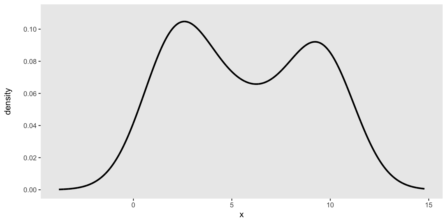
Actually drawing samples from this distribution is a simple call to genDataDensity. The key argument is the data distribution as as represented by the vector of integers:
dx <- genDataDensity(10000, dataDist = base_data, varname = "x1")Here’s a look at the sampled data and their relationship to the target density:
ggplot(data = dx, aes(x=x1)) +
  geom_histogram(aes(y = after_stat(count / sum(count))),
    binwidth = 1, fill = "grey", color = "black", alpha = .2) +
  geom_line(data = den_curve, aes(x = x, y = y),
    color = "black", linewidth = 2) +
  scale_y_continuous(name = "density\n", limits = c(0, 0.11),
     breaks = seq(0, .10, by = .02)) +
  scale_x_continuous(limits = c(-6, 15), breaks = seq(-5, 10, by = 5)) +
  theme(panel.grid = element_blank(),
        plot.title = element_text(face = "bold", size = 10))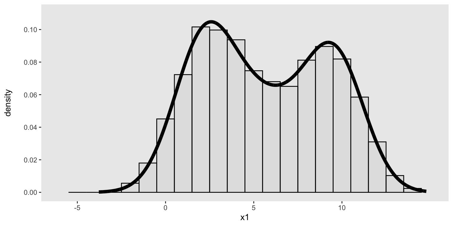
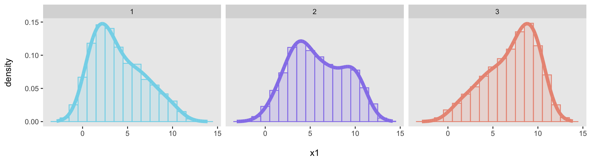
Just to show that this was not a fluke, here are three additional target distributions, specified with three different vectors:
base_data <- list(
  c(1, 1, 1, 1, 1, 2, 2, 2, 2, 3, 3, 3, 3, 4, 4, 5, 5, 6, 6, 7,   7,  8,  9, 10),
  c(1, 2, 2, 3, 3, 4, 4, 4, 4, 4, 4, 5, 6, 6, 7, 7, 7, 8, 9, 10, 10, 10, 10, 10),
  c(1, 2, 3, 4, 4, 5, 5, 6, 6, 7, 7, 8, 8, 8, 8, 9, 9, 9, 9, 10, 10, 10, 10, 10)
)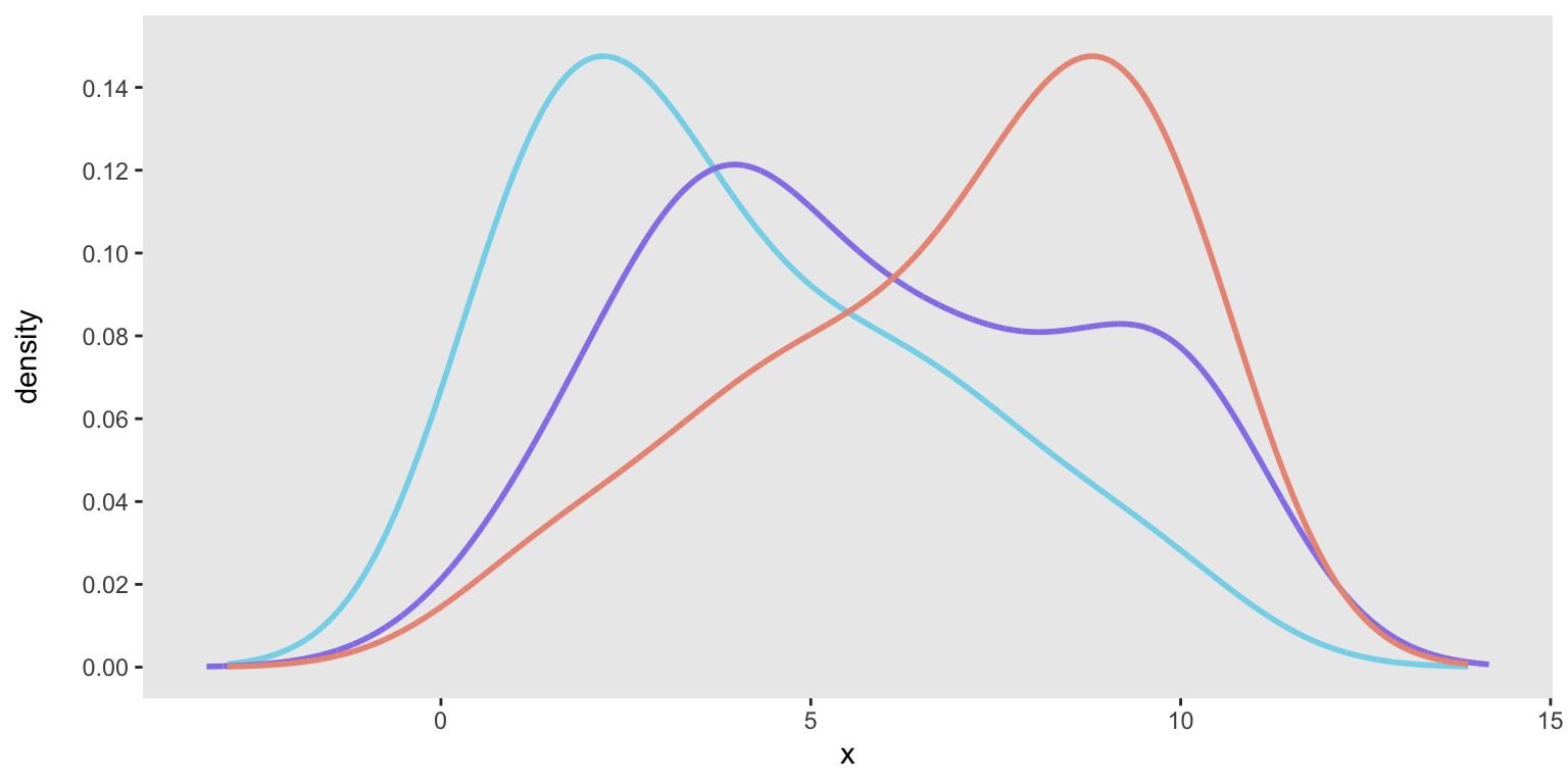
We can generate data from each of the distributions and then confirm that each one adequately fits its target distribution:
dx1 <- genDataDensity(10000, dataDist = base_data[[1]], varname = "x1")
dx2 <- genDataDensity(10000, dataDist = base_data[[2]], varname = "x1")
dx3 <- genDataDensity(10000, dataDist = base_data[[3]], varname = "x1")
Addendum: code to generate multiple distribution plot
Here is a little more detail in case someone might find it useful to have the code that generates the “facet” plot. In the plot with the single distribution, I specified the histogram with this command:
geom_histogram(aes(y = after_stat(count / sum(count))), ...)When I tried to apply this to the “facet” plot, the denominator of that plot (sum(count)) was not calculated for each subgroup (i.e., dataset), but was the total across all datasets. As a result, the dataset-specific proportions were underestimated; we can see that here:
dx <- rbindlist(list(dx1, dx2, dx3), idcol = TRUE)

ggplot(data = dx, aes(x=x1)) +
  geom_histogram(
    aes(y = after_stat(count / sum(count)), fill = factor(.id), color = factor(.id)),
    binwidth = 1, alpha = .2) +
  geom_line(data = dens, aes(x = x, y = y, color = factor(.id)), linewidth = 2) +
    xlab("\nx1") +
  ylab("density\n") +
  scale_fill_manual(values = colors) +
  scale_color_manual(values = colors) +
  theme(panel.grid = element_blank(),
        plot.title = element_text(face = "bold", size = 10),
        legend.position = "none") +
facet_grid(~ .id) 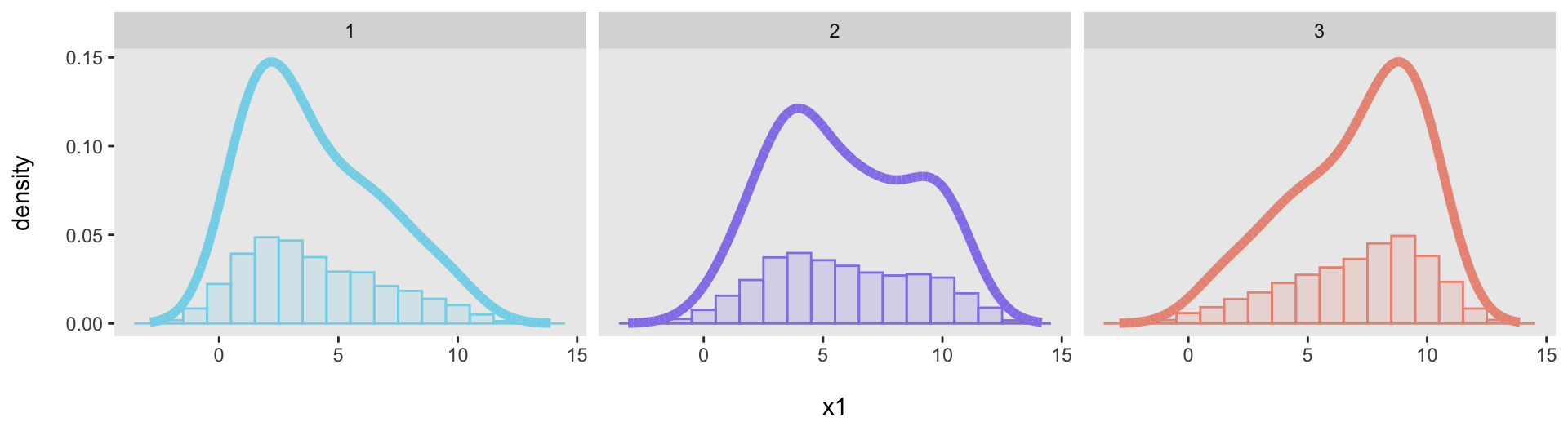
I looked around for a way to address this, but couldn’t find anything that obviously addressed this shortcoming (though I am convinced it must be possible, and I just couldn’t locate the solution). I considered using ggarrangeor something similar, but was not satisfied with the results. Instead, it turned out to be faster just to calculate the proportions myself. This is the process I used:
First, I created a dataset with the bins (using a bin size of 1):
cuts <- seq(dx[,floor(min(x1))], dx[,ceiling(max(x1))], by = 1)
dcuts <- data.table(bin = 1:length(cuts), binlab = cuts)

dcuts
## bin binlab
## <int> <num>
## 1: 1 -3
## 2: 2 -2
## 3: 3 -1
## 4: 4 0
## 5: 5 1
## 6: 6 2
## 7: 7 3
## 8: 8 4
## 9: 9 5
## 10: 10 6
## 11: 11 7
## 12: 12 8
## 13: 13 9
## 14: 14 10
## 15: 15 11
## 16: 16 12
## 17: 17 13
## 18: 18 14Then, I allocated each observation to a bin using the cut function:
dx[, bin := cut(x1, breaks = cuts, labels = FALSE)]
dx <- merge(dx, dcuts, by = "bin")

dx
## Key: <bin>
## bin .id id x1 binlab
## <int> <int> <int> <num> <num>
## 1: 1 1 1251 -2.097413 -3
## 2: 1 1 2215 -2.580587 -3
## 3: 1 1 2404 -2.042049 -3
## 4: 1 1 3228 -2.078958 -3
## 5: 1 1 5039 -2.055471 -3
## ---
## 29996: 17 3 7690 13.290347 13
## 29997: 17 3 8360 13.083991 13
## 29998: 17 3 8860 13.149421 13
## 29999: 17 3 9214 13.043727 13
## 30000: 17 3 9743 13.199752 13Finally, I calculated the distribution-specific proportions (showing only the second distribution):
dp <- dx[, .N, keyby = .(.id, binlab)]
dp[, p := N/sum(N), keyby = .id]

dp[.id == 2]
## Key: <.id>
## .id binlab N p
## <int> <num> <int> <num>
## 1: 2 -3 3 0.0003
## 2: 2 -2 38 0.0038
## 3: 2 -1 130 0.0130
## 4: 2 0 340 0.0340
## 5: 2 1 619 0.0619
## 6: 2 2 938 0.0938
## 7: 2 3 1161 0.1161
## 8: 2 4 1155 0.1155
## 9: 2 5 1035 0.1035
## 10: 2 6 882 0.0882
## 11: 2 7 828 0.0828
## 12: 2 8 861 0.0861
## 13: 2 9 822 0.0822
## 14: 2 10 641 0.0641
## 15: 2 11 384 0.0384
## 16: 2 12 140 0.0140
## 17: 2 13 23 0.0023And now the facet plot will work just fine. Here is the code and the plot (again).
ggplot(data = dp, aes(x = binlab, y = p)) +
  geom_bar(aes(fill = factor(.id), color = factor(.id)), stat = "identity", alpha = .4) +
  geom_line(data = dens, aes(x = x, y = y, color = factor(.id)),
            linewidth = 2) +
  xlab("\nx1") +
  ylab("density\n") +
  scale_fill_manual(values = colors) +
  scale_color_manual(values = colors) +
  theme(panel.grid = element_blank(),
        plot.title = element_text(face = "bold", size = 10),
        legend.position = "none") +
facet_grid(~ .id) 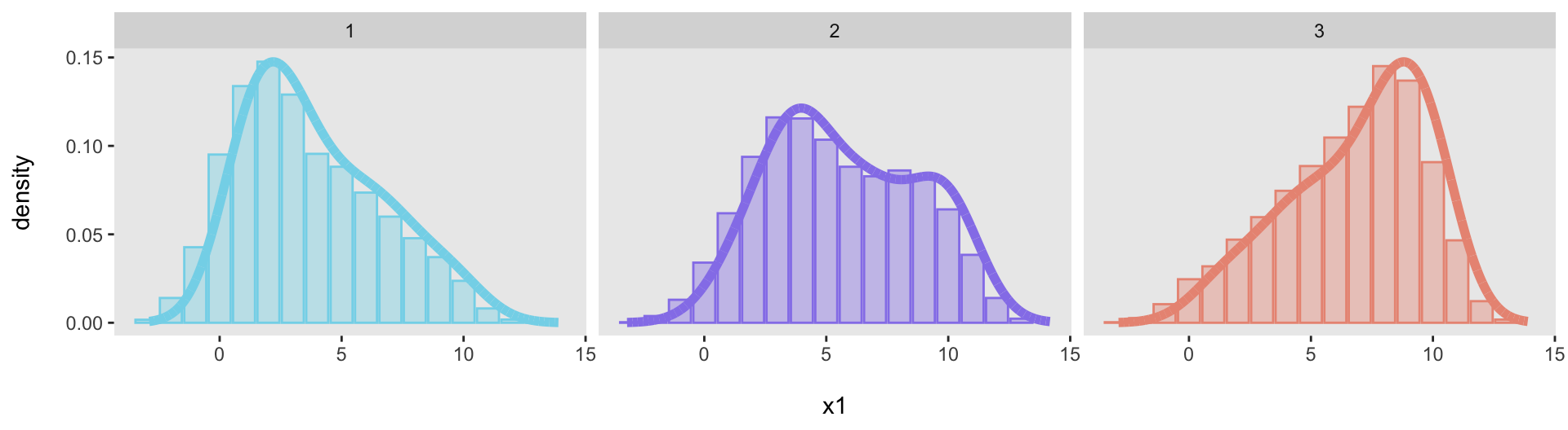
Addendum follow-up
Well, that was quick. Andrea provided code on Disqus - which for some reason is no longer publishing on my site, and if anyone has thoughts about that issue, feel free to contact me :) - that does exactly what I was trying to do without any pre-plotting data transformations. The trick is to use the density stat available in geom_histogram, This actually looks better, because it lines up more precisely with the density curve.
ggplot(data = dx, aes(x=x1)) +
  geom_histogram(
    aes(y = after_stat(density), fill = factor(.id), color = factor(.id)),
    binwidth = 1, alpha = .2) +
  geom_line(data = dens, aes(x = x, y = y, color = factor(.id)), linewidth = 2) +
  xlab("\nx1") +
  ylab("density\n") +
  scale_fill_manual(values = colors) +
  scale_color_manual(values = colors) +
  theme(panel.grid = element_blank(),
        plot.title = element_text(face = "bold", size = 10),
        legend.position = "none") +
  facet_grid(~ .id)