In the previous post I described how to determine the parameter values for generating a Weibull survival curve that reflects a desired distribution defined by two points along the curve. I went ahead and implemented these ideas in the development version of simstudy 0.4.0.9000, expanding the idea to allow for any number of points rather than just two. This post provides a brief overview of the approach, the code, and a simple example using the parameters to generate simulated data.
The distribution
Just to recap briefly (really, take a glance at the previous post if you haven’t already - this post may make a bit more sense), the times to an event can be drawn from the Weibull distribution by generating a uniform random \(u\) variable between 0 and 1 that represents the survival probability. There are two parameters that I am using here - the formula \(f\) and shape \(\nu\). (There is a third possible scale parameter \(\lambda\) that I have set to 1 as a default, so that \(f\) alone determines the scale.)
\[T = \left[ \frac{- \text{log}(u) }{\text{exp}(f)} \right] ^ \nu\]
Determining the parameter values
If we have some idea about how the shape of the survival curve might look, we can use this information to find the parameters that will allow us to draw simulated data from that distribution. When I say “we might have some idea,” I mean that we need to have survival probabilities in mind for specific time points.
Last time, I showed that if we have two time points and their associated probabilities, we can generate parameters that define a curve that passes through both points. In the main body of that post I proposed a simple analytic solution for the parameters, but in the
addendum of the previous post, I suggested we can minimize a simple loss function to find the same parameters. I’ve decided to implement the minimization algorithm in simstudy, because it can more flexibly incorporate any number of input points, not just two. Here is the more general loss function for \(k\) input points:
\[\sum_{i=1}^k\left[ \nu^* \ (\text{log} \left[ -\text{log}(u_i)\right] - f^*) - \text{log}(T_i) \right]^2\]
Implementing the optimization in R
Below is a version of the function survGetParams that is implemented in simstudy. The key components are the specification of the loss function to be optimized and then using the R base optim function to find the pair of parameters that minimize the this function. The optim function requires starting values for the parameters, as well as the data points that are to be used to define the curve. In addition, we set a lower boundary on the shape parameter, which cannot be negative.
library(simstudy)
library(data.table)
library(ggplot2)
library(survival)
library(survminer)
survGetParams <- function(points) {
loss_surv <- function(params, points) {
loss <- function(a, params) {
( params[2]*(log(-log(a[2])) - params[1]) - log(a[1]) ) ^ 2
}
sum(sapply(points, function(a) loss(a, params)))
}
r <- optim(
par = c(1, 1),
fn = loss_surv,
points = points,
method = "L-BFGS-B",
lower = c(-Inf, 0),
upper = c(Inf, Inf)
)
return(r$par)
}In the first example, we would like to find the parameters for a distribution where 20% of the population has an event (e.g. does not survive) before 100 days and 90% have an event before 200 days. Alternatively, we can say 80% survive until day 100, and 10% survive until day 200:
points <- list(c(100, 0.80), c(200, 0.10))
r <- survGetParams(points)
r
## [1] -17.0065167 0.2969817We can view the Weibull curve generated by the optimized parameters in the using the function survParamPlot, which is also implemented in simstudy. When we specify two points, we can find an exact curve:
survParamPlot <- function(f, shape, points, n = 100) {

  u <- seq(1, 0.001, length = n)

  dd <- data.table::data.table(
    f = f,
    shape = shape,
    T = (-(log(u)/exp(f)))^(shape),
    p = round(1 - cumsum(rep(1/length(u), length(u))), 3)
  )

  dpoints <- as.data.frame(do.call(rbind, points))

  ggplot(data = dd, aes(x = T, y = p)) +
    geom_line(size = 0.8) +
    scale_y_continuous(limits = c(0,1), name = "probability of survival") +
    scale_x_continuous(name = "time") +
    geom_point(data = dpoints, aes(x = V1, y = V2),
                    pch = 21, fill = "#DCC949", size = 2.5) +
    theme(panel.grid = element_blank(),
          axis.text = element_text(size = 7.5),
          axis.title = element_text(size = 8, face = "bold")
    )

}
survParamPlot(f = r[1], shape = r[2], points)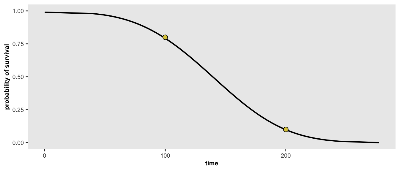
If for some reason, we have additional information about the target distribution that we want to simulate from, we can re-optimize the parameters. In this case, we’ve added an additional constraint that 5% will survive longer than 300 days. With this new set of points, the optimized curve will not necessarily pass through all the points.
points <- list(c(100, 0.80), c(200, 0.10), c(300, 0.05))
r <- survGetParams(points)
survParamPlot(f = r[1], shape = r[2], points)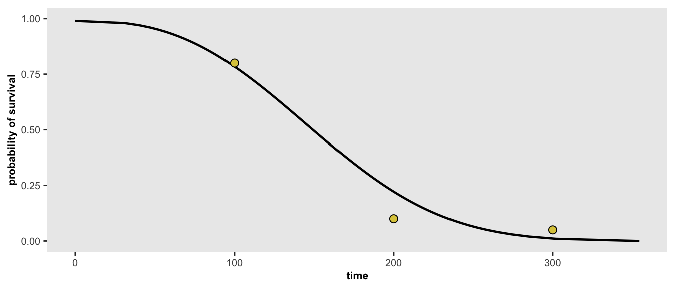
And finally - here is one last scenario, where we have four target probabilities:
points <- list(c(100, 0.80), c(120, 0.50), c(200, 0.10), c(300, 0.05))
r <- survGetParams(points)
survParamPlot(f = r[1], shape = r[2], points)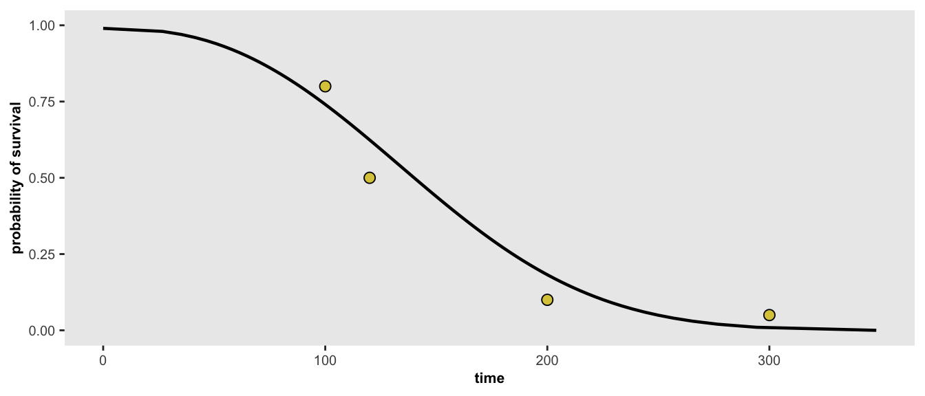
Simulating data from a desired distribution
With a target distribution in hand, and a pair of parameters, we are now ready to simulate data. In the first example above, we learned that \(f = -17\) and \(\nu = 0.3\) gives define the distribution where 80% survive until day 100, and 10% survive until day 200. We can simulate data from that distribution to see how well we do. And while we are at, I’ll add in a treatment that improves survival time (note that negative coefficients imply improvements in survival).
defD <- defData(varname = "rx", formula = "1;1", dist = "trtAssign")
defS <- defSurv(varname = "time", formula = "-17 - 0.8 * rx", scale = 1, shape = 0.3)

set.seed(11785)
dd <- genData(200, defD)
dd <- genSurv(dd, defS, digits = 0)
dd$status <- 1

dd
## id rx time status
## 1: 1 1 180 1
## 2: 2 1 189 1
## 3: 3 1 183 1
## 4: 4 1 280 1
## 5: 5 1 84 1
## ---
## 196: 196 0 219 1
## 197: 197 1 273 1
## 198: 198 0 131 1
## 199: 199 1 261 1
## 200: 200 1 203 1Eyeballing the survival curve for the control arm (\(rx = 0\)), we can see that this roughly matches the distribution of 80%/100 and 10%/200. Incidentally, the survival curve for the treatment arm has effectively been generated by a distribution with parameters \(f=-17.8\) and \(\nu = 0.3\).
fit <- survfit( Surv(time, status) ~ rx, data = dd )
ggsurvplot(fit, data = dd, palette = c("#7D9D33","#CD8862"))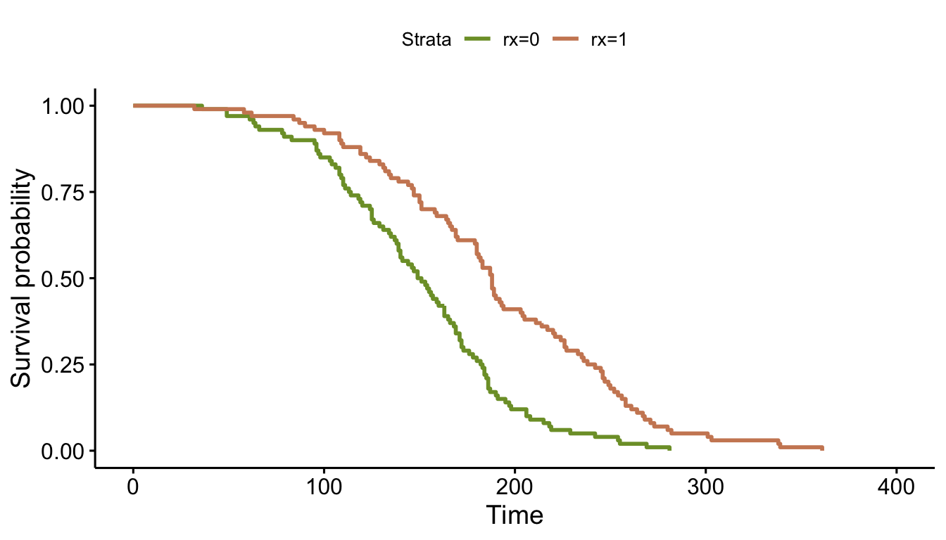
Under the assumption of a constant shape (that is \(\nu\) is equivalent for both arms), the log hazard ratio can be viewed as the shift of the scale parameter (here represented entirely by \(f\)). While that probably won’t help anyone understand the real world implications of the hazard ratio, it does provide some insight into the underlying data generation process.
coxfit <- coxph(Surv(time, status) ~ rx, data = dd)| Characteristic | log(HR)1 | 95% CI1 | p-value |
|---|---|---|---|
| rx | -0.78 | -1.1, -0.49 | <0.001 |
|
1
HR = Hazard Ratio, CI = Confidence Interval
|
|||